
Christmas Bedroom Decor: Intentional Color Schemes
Buying a red throw and a green garland before checking what color the walls really are is the mistake that sinks most holiday bedrooms. Good christmas bedroom decor starts with undertone, and the ornaments come last.
Below are 26 palette and undertone pairings, with paint names, scale notes and the specific trap each one hides. Pick one family, hold a swatch up at 4pm, and work from there.
The color logic behind great christmas bedroom decor
Christmas bedroom decor works when the wall, the bedding and the accents all lean the same way, warm or cool. A red with a blue undertone fights a yellow-green garland. Matching undertones matters more than matching hues.
Use a 60-30-10 split. Sixty percent is the wall and large furniture, thirty is bedding and curtains, and ten is the seasonal accent. Proportion is the first test: a bed is roughly 60 by 80 inches, so one oversized red element will dominate everything else in the room.
1. Alabaster walls with cranberry bedding
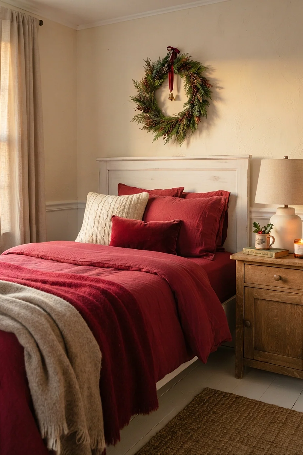
Sherwin-Williams Alabaster has a creamy, slightly yellow base, which is why a cranberry duvet looks rich against it instead of harsh. Blue-leaning builder whites do the opposite and turn red sour. This pairing suits rooms under 120 square feet, where the wall needs to stay quiet.
Limit the red to two pieces, the duvet and one 18-inch pillow. Spare red linens fit in a lidded ottoman at the foot of the bed, so the room never tips into overload.
2. Hale Navy with brass and cream
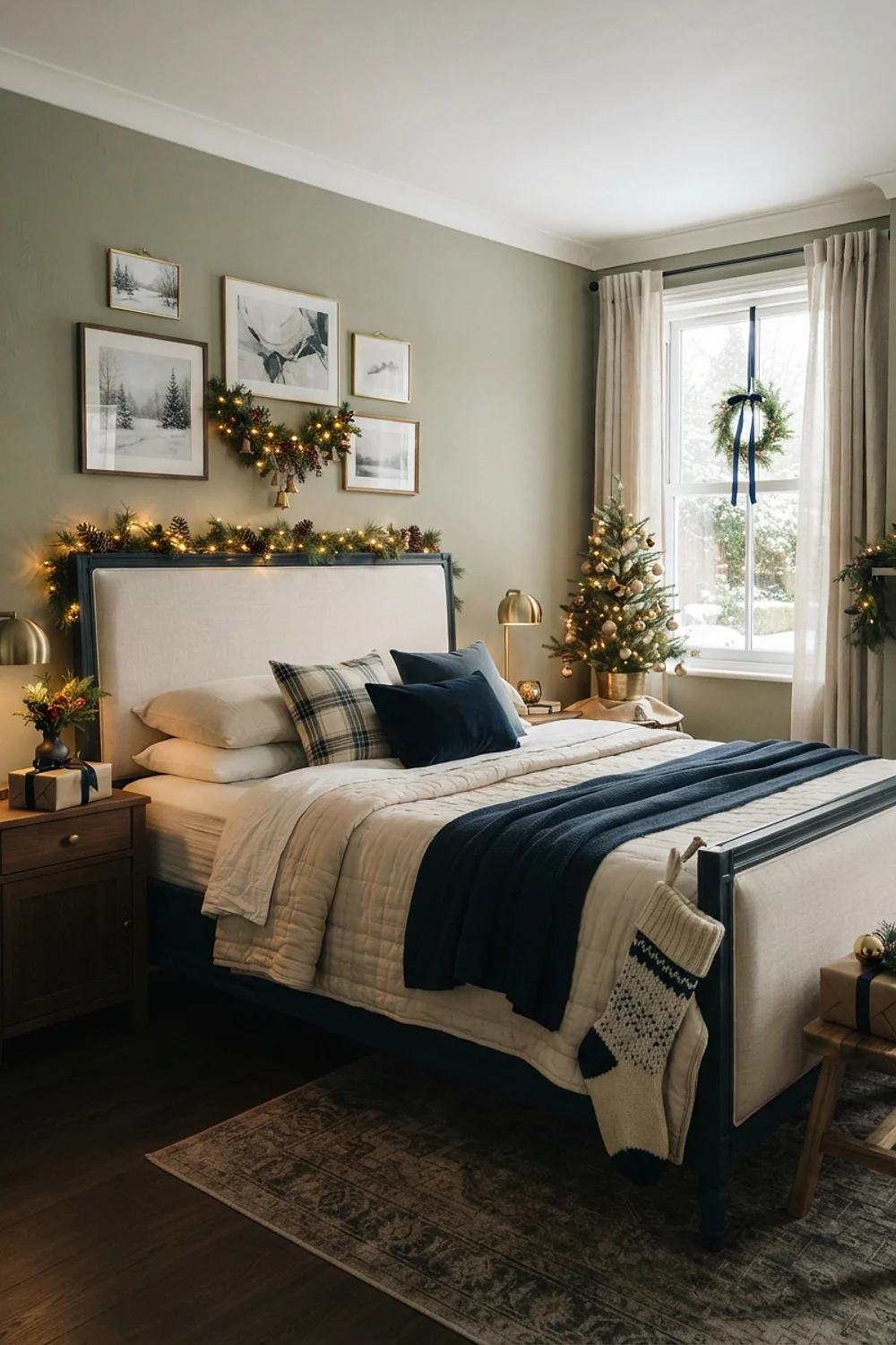
Benjamin Moore Hale Navy is a gray-leaning navy, so it reads as ink at night and slate by 4pm, when low winter light rakes across it. Brass candlesticks and a cream wool throw catch that glow beautifully.
Check the metal before buying. Brass plating over zinc flakes within a season, while solid brass runs around $45 for a 10-inch pair and ages well. A north-facing room with one window needs a lamp on at dusk, or the navy swallows it.
3. Sage green and oatmeal linen

An oatmeal linen duvet against sage walls reads like frost on a pine branch, and it suits anyone who finds saturated holiday colors loud. The softness hides in the proportions, though.
Cut a eucalyptus garland to about two-thirds of the headboard width, roughly 40 inches on a queen. A full-width swag looks like a fence, and a 12-inch sprig vanishes behind the pillows.
4. Charcoal walls with pine green accents

Dark walls blur the corners of a small bedroom, which is why charcoal such as Benjamin Moore Kendall Charcoal can make a 10-by-11 room feel less boxy. That’s the counterintuitive part. Light walls actually draw the boundaries sharper.
Put real pine in a 14-inch ceramic vase on the dresser, and let the green be the only saturated color. Skip red here. Against charcoal, it turns muddy and slightly brown.
5. Blush pink and forest green

Plaster-pink walls, in the family of Farrow & Ball Setting Plaster, make forest green velvet look like it belongs to a different century. Layer three pillow sizes: a 22-inch square, an 18-inch square and a 12-by-20 lumbar.
Velvet covers in forest green start around $28 each. Avoid hot pink-leaning blushes, since they make the green look flat and dusty. This one suits a bedroom with white trim and a lot of daylight.
6. Greige walls with copper and rust
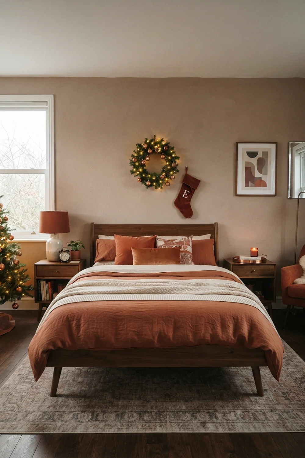
A bedside lamp with a copper base does real work: at 24-26 inches tall, the bulb sits near eye level when you’re propped up reading. Pair it with a rust-orange throw against a greige wall like Sherwin-Williams Accessible Beige.
Greige tolerates mixed lighting better than most colors, so it’s ideal for rooms with one window and two lamps. Use 2700K bulbs, because daylight-white ones turn the copper greenish.
7. Ice blue and silver

Flannel sheets and a 50-by-60-inch faux-fur throw are what rescue an icy palette from feeling like a hospital ward. Pale blue walls, silver mercury-glass ornaments and white bedding need that texture.
This scheme suits south-facing bedrooms that flood with light. In a north-facing room it goes cold fast, so choose a blue with a touch of gray in it and keep the bulbs amber.
8. Burgundy velvet against taupe
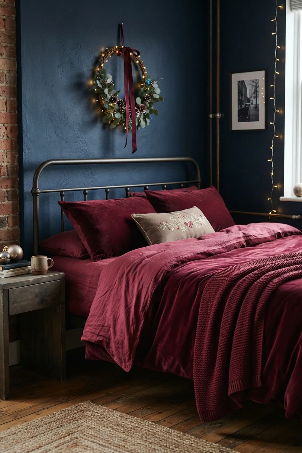
Matching a burgundy headboard with a yellow-green garland is the common mistake here. Burgundy leans blue, so it wants taupe, mushroom and a cool, blue-green fir.
Taupe walls give the velvet a neutral stage, and the dark red then reads as one deep shape instead of a splotch. Hold the garland up beside the headboard before hanging, and trade it out if the two fight.
9. Cream and gold with a black bed frame

A black iron frame sets the layout: center a 36-inch wreath above the bed, flank it with nightstands at least 20 inches wide, and keep gold on both sides for balance. Cream walls stop the black from feeling severe.
Mercury-glass gold ornaments cost about $15 for a set of six. Place them in matching groupings on each nightstand, since a lone gold cluster on one side tips the whole composition.
Moody and saturated christmas bedroom decor palettes
10. Evergreen Fog with white birch
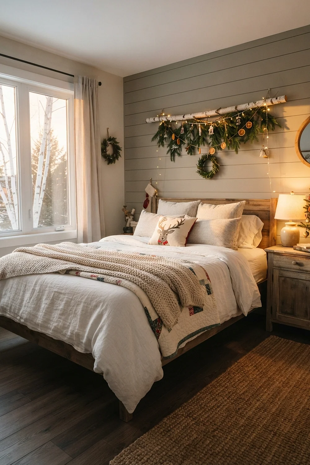
Sherwin-Williams Evergreen Fog is a gray-green that reads olive under 2700K lamps and cool gray under daylight bulbs. Rooms lit mostly by lamps get the richer, olive version.
White birch branches in a tall floor vase, about 36 inches, stand out against it like bare trees in fog. Avoid yellow-white sheets here. They turn muddy against the green, so pick bright cotton instead.
11. Pewter and plum
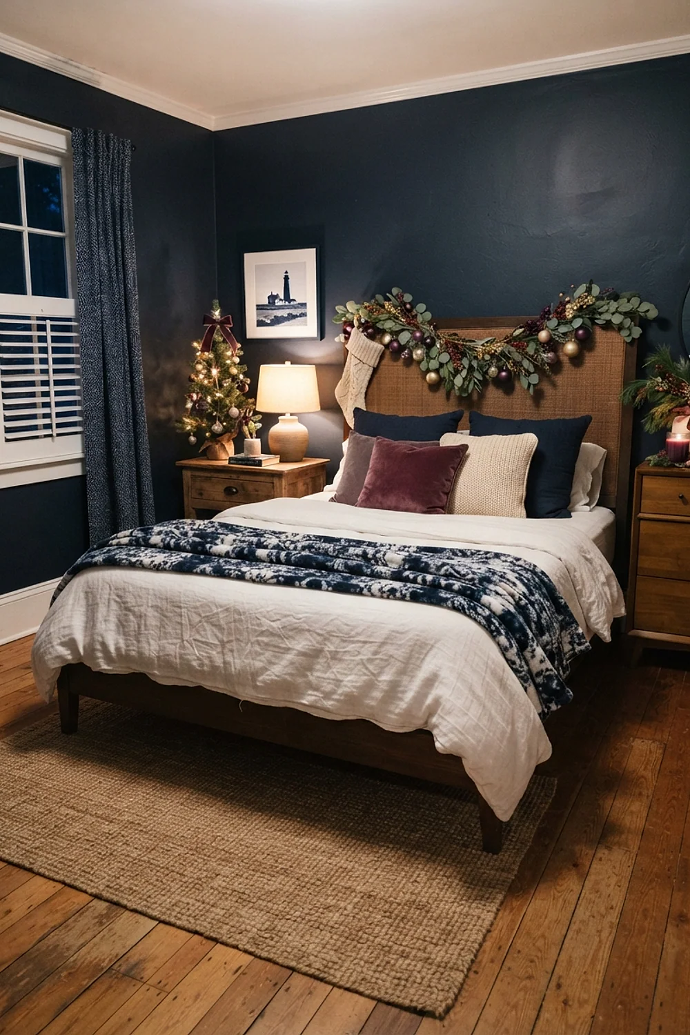
Plum bedding with pewter candle holders makes a quiet, late-evening scheme for adults who dislike conventional holiday red. Pewter is heavy, so keep candle holders on a 12-by-16-inch tray that lifts away in one move.
Under-bed bins about 6 inches tall are where the spare plum linens and the pewter go in January. Plum with too much red in it clashes with pewter, so choose an aubergine that leans blue.
12. Terracotta and olive
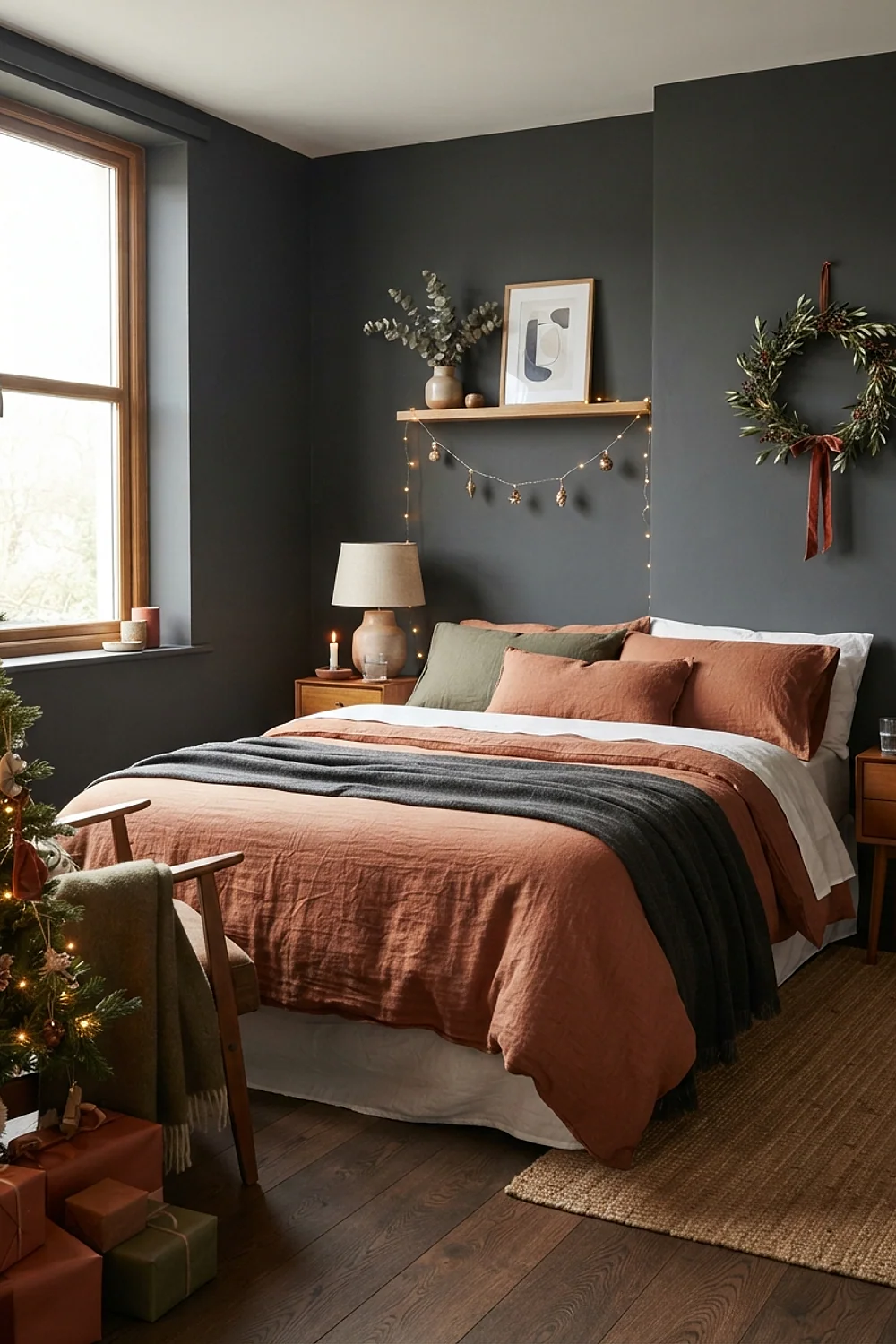
Matte clay-colored walls like Sherwin-Williams Cavern Clay feel earthy, and unglazed terracotta pots hold up to handling. Olive wool and dried eucalyptus belong in the same family.
The warmth comes from material instead of tinsel, so it suits people who want a low-sparkle bedroom. Keep the olive muted. A bright lime-leaning green makes the terracotta look like a flowerpot shop.
13. Chocolate brown and champagne
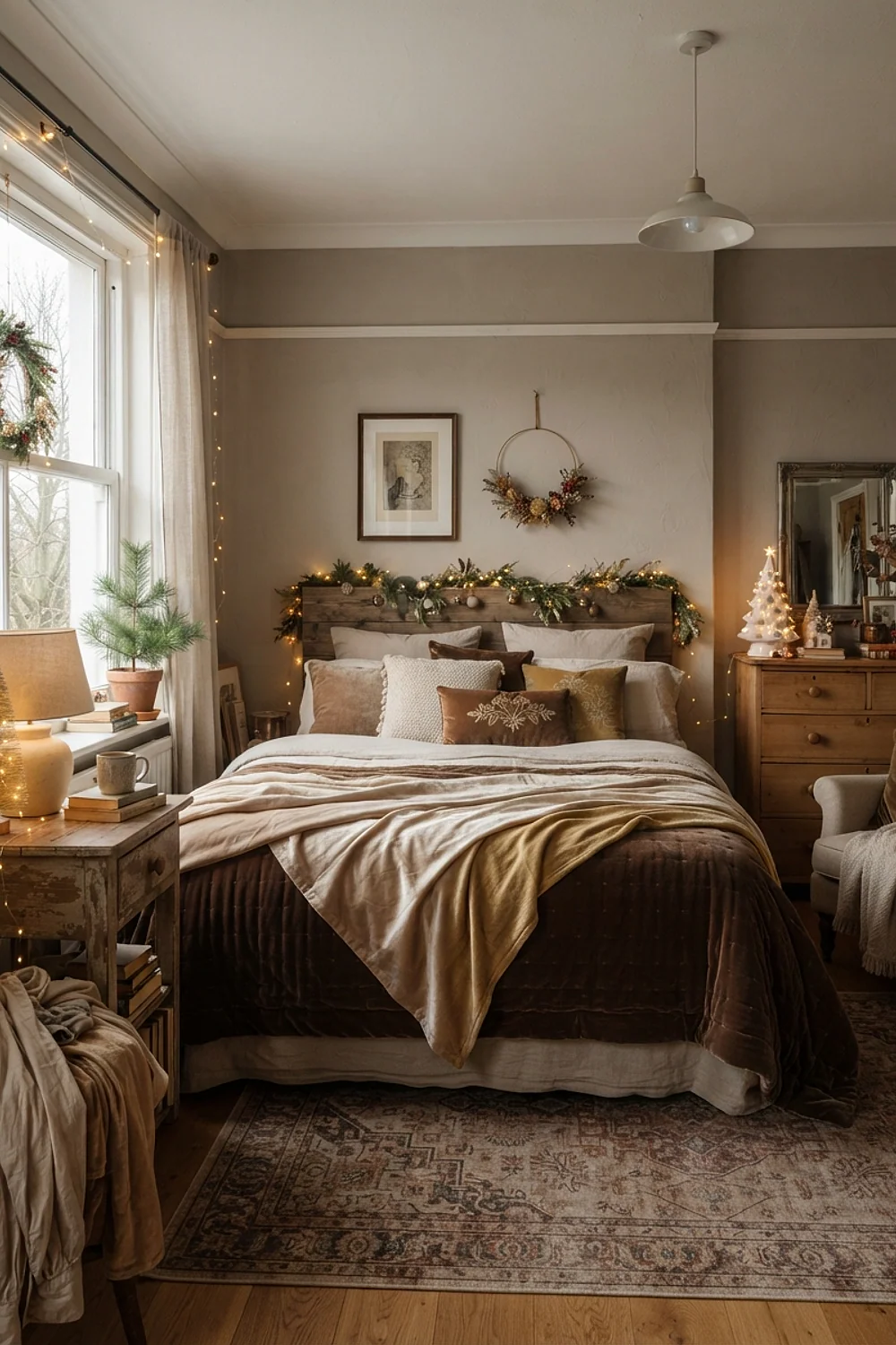
A 30-inch tabletop tree with 4-inch champagne ornaments looks right on a dresser, while 8-inch baubles on the same tree make it look like it’s about to tip. Chocolate walls swallow light, so the ornaments need to be bright.
Champagne glass balls run about $20 for a dozen. Choose them over true gold, which can go brassy against brown, and keep the bedding in ivory.
14. Peacock teal and ivory
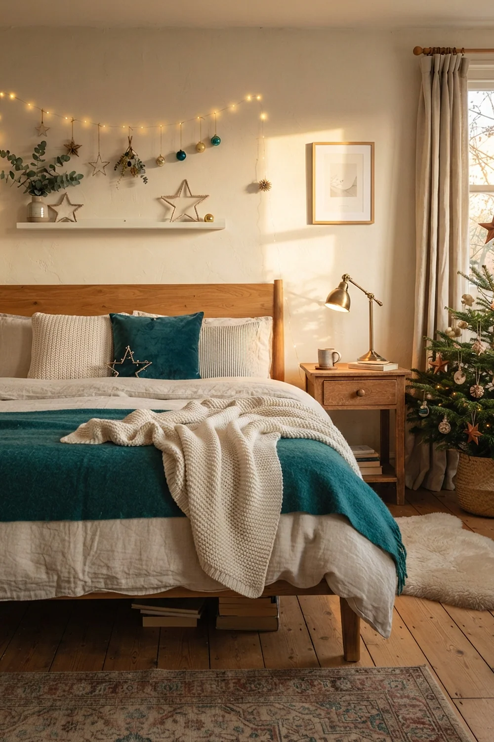
Ivory bedding gives a deep teal wall, something like Benjamin Moore Aegean Teal, somewhere to breathe. The paint carries the color, so the decor can stay minimal.
A single ivory wreath, 24 inches across, over the bed is enough. This palette suits rooms with 9-foot ceilings that can handle a deep wall. In a low room, paint only the headboard wall.
15. Black walls with white lights
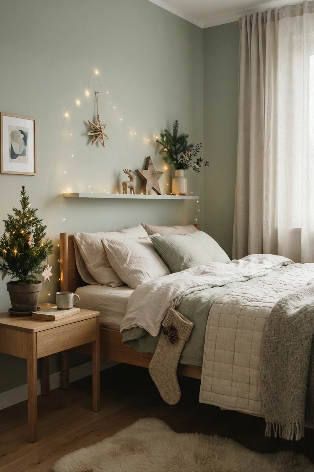
A strand of white lights strung against walls painted in Sherwin-Williams Tricorn Black reads like a field of constellations. Drape a 10-foot strand across the headboard in loose swags, never a straight line, with each loop about 14 inches deep.
Matte finishes soak up reflections, so use them if the walls are rough or the room is small. Keep every textile pale, because three dark textiles in a black room flatten the whole scene.
16. Red walls with cream trim
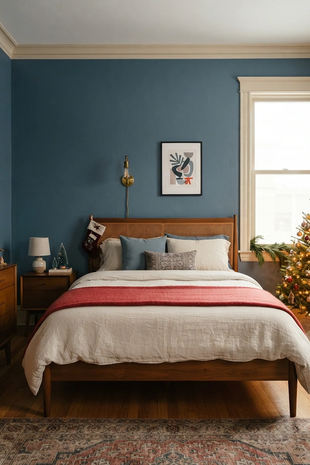
Farrow & Ball Eating Room Red is a brick red that stays calm after dark. Bedrooms are for sleep, though, and saturated red tends to stimulate.
Paint just the wall behind the bed and leave the rest cream, so the color frames you instead of surrounding you. This works best in rooms with a window opposite, which balances the heat of the wall.
17. Mauve and mushroom

A chunky knit throw, 50 by 60 inches and about $60, is the single best texture investment for a mauve and mushroom room. Because the palette is low in contrast, thick yarn and bouclé pillows in the same tones add shadow and depth, so the layers feel soft rather than flat.
This suits readers who like dusk-colored rooms, especially bedrooms with limited light where a muted scheme feels calming. Mauve with too much pink turns candy-like next to mushroom, so choose a gray-leaning version and sample it first.
18. Butter yellow with holly green
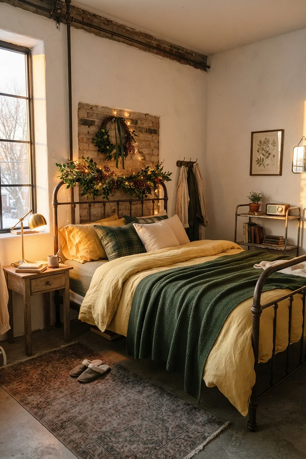
Butter yellow walls throw a yellow cast onto everything beside them, and that cast turns holly green bedding slightly olive. This is the most common slip with a yellow room.
Choose a blue-leaning holly, or keep the green to a single narrow runner of 14 by 60 inches across the bed. Yellow suits sunny rooms and east-facing windows, where morning light is warm enough to carry it.
Light and neutral christmas bedroom decor palettes
19. Oat white and wood tones
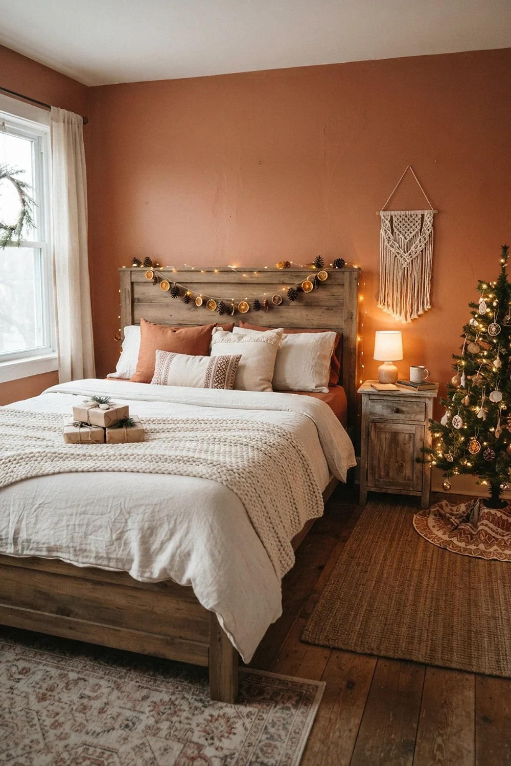
Leave 24-30 inches of walking space around the bed, then put a 4-foot tabletop tree on the dresser instead of the floor. A floor tree in a small bedroom eats half the circulation space.
Oat white walls and honey-colored wood are forgiving, and they suit anyone who changes decor yearly. Skip cool white bedding here. It makes the wood look orange.
20. Pale gray and white faux fur
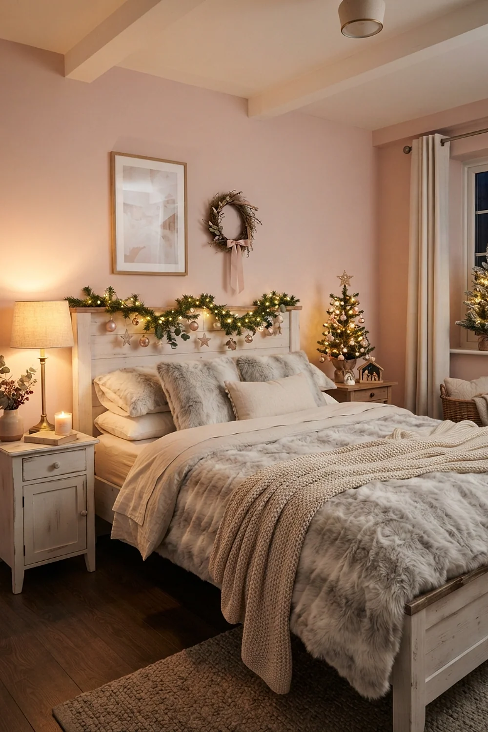
White faux fur bounces lamp light back into the room, which is why it works against light gray walls such as Benjamin Moore Gray Owl. Put the lamps on dimmers and keep them near 2700K.
This palette suits rooms that need brightness, such as one with a single narrow window. A blue-leaning gray looks cold in winter, so pick a gray with a touch of green or beige.
21. Dusty rose and walnut
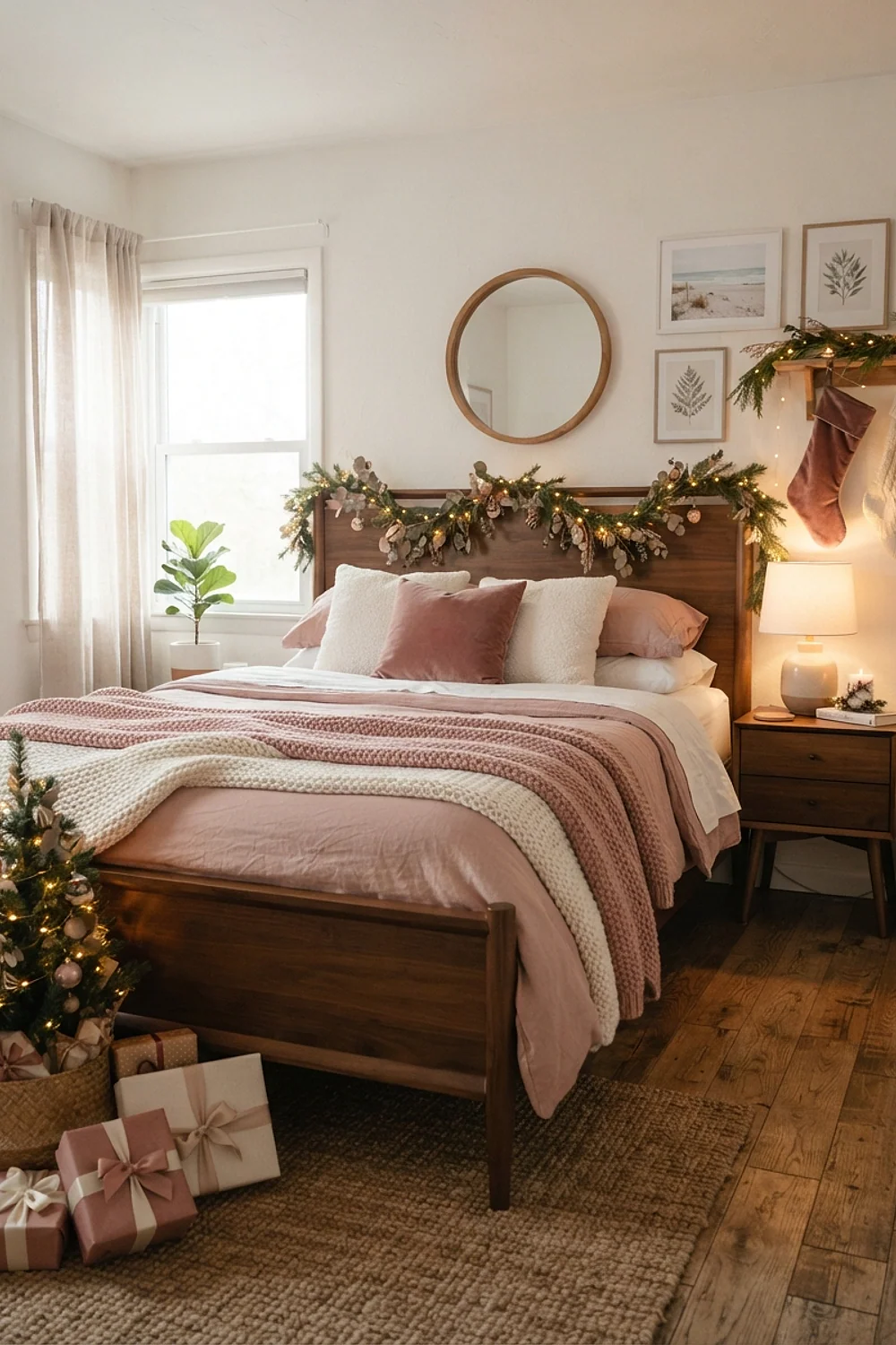
A 36-inch walnut trunk at the foot of the bed holds spare linens and is sturdy enough to sit on. Its dark grain anchors the bed and keeps dusty rose from turning sugary, giving the soft color a grounded counterweight.
Trunks suit bedrooms without closet space, but they need at least 18 inches of clearance at the bed’s foot to open. Avoid orange-leaning walnut stains, since they fight with rose; pick a brown-leaning, slightly cool finish instead.
22. Greige with buffalo check

Buffalo check flannel is cut in 2-inch squares, and the 5-6 ounce weight feels like a brushed shirt. A queen set runs about $90. Against greige walls, the red and black check looks bold without screaming, because the neutral backdrop absorbs some of the contrast.
It suits cabin-style rooms and families with kids, since flannel is forgiving and washes soft. Avoid mixing it with other patterns, since one check is enough; keep pillows and throws solid so the squares stay the focus.
23. Pale blue and rust
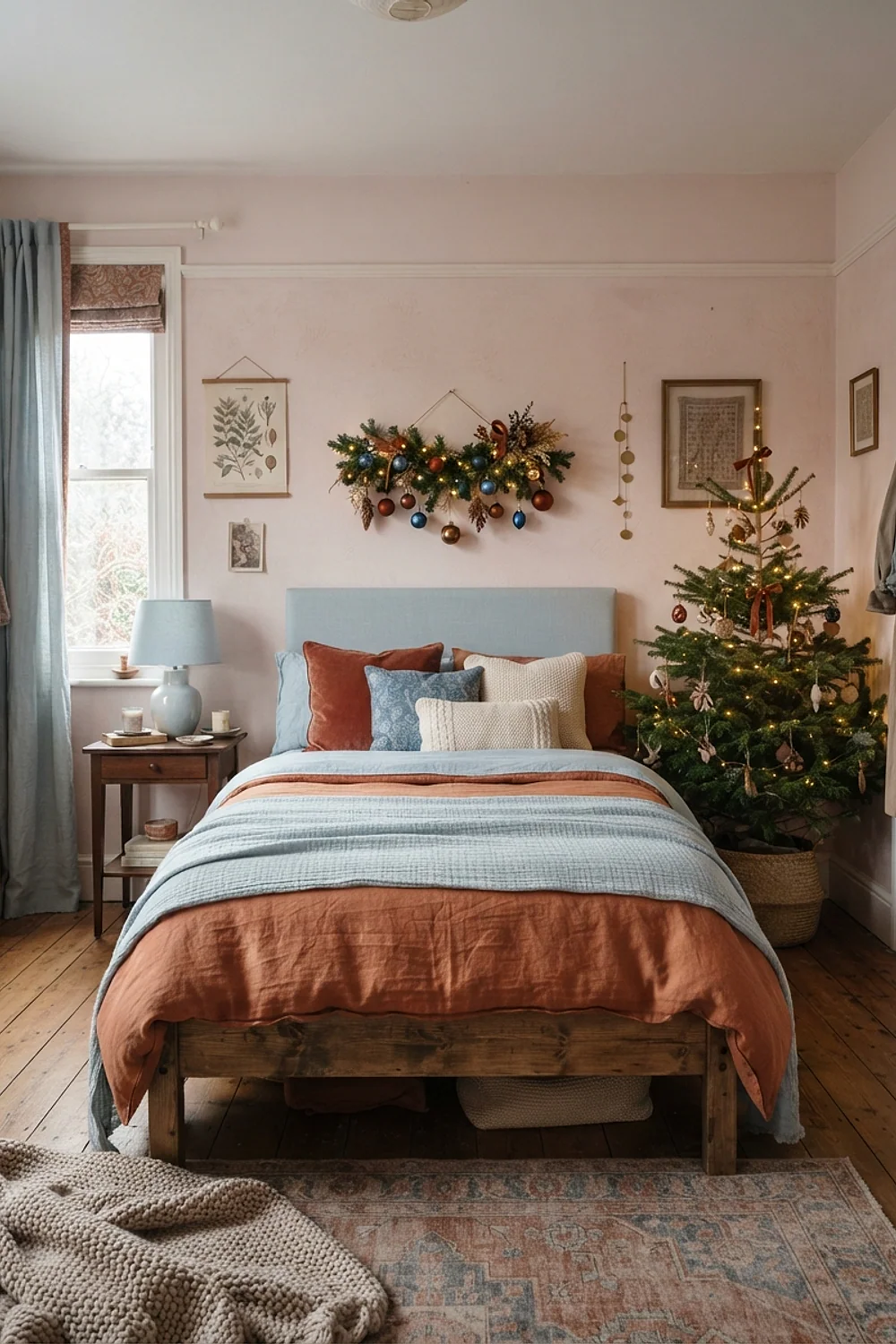
A 2-inch rust stripe on a quilt reads as a stripe on a king bed, but as a smudge on a twin. Scale the pattern to the bed.
Pale blue walls make rust feel like autumn lingering into winter. This works in rooms with white trim and oak floors. Skip orange-red rust, which looks like a traffic cone against blue.
24. All-white with a single red object
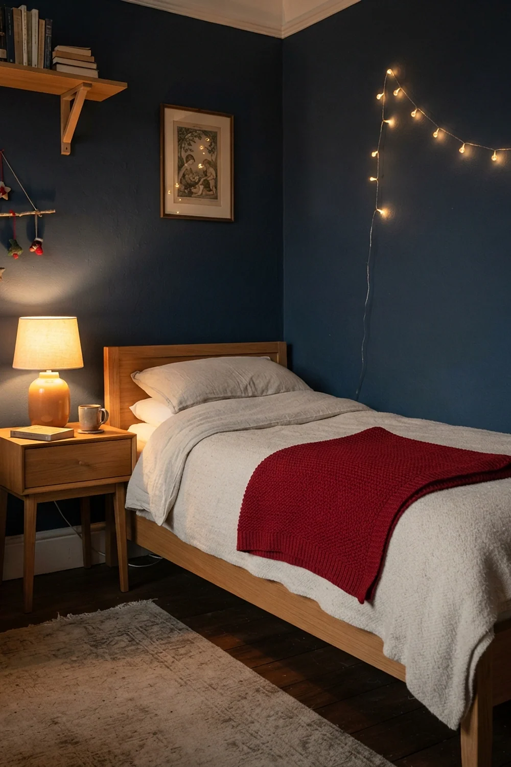
With Benjamin Moore White Dove on the walls and white bedding, one red velvet bolster of about 24 inches becomes the whole ten percent of the 60-30-10 split. Restraint is the point here.
This suits renters who can’t paint, and anyone who dislikes clutter. Don’t add a second red object. The moment there are two, the first one stops looking intentional.
25. Sand and olive with natural wood

A wood bead garland costs about $20 and works well on a sand-colored wall. Add olive branches in a clay jug and a linen duvet, and the room looks like it’s been that way all year.
The material choices matter more than color in this palette. Real wood, linen and clay hold up to touch. Plastic garlands in the same colors read shiny, and that shine gives them away.
26. Stormy gray-blue and cream
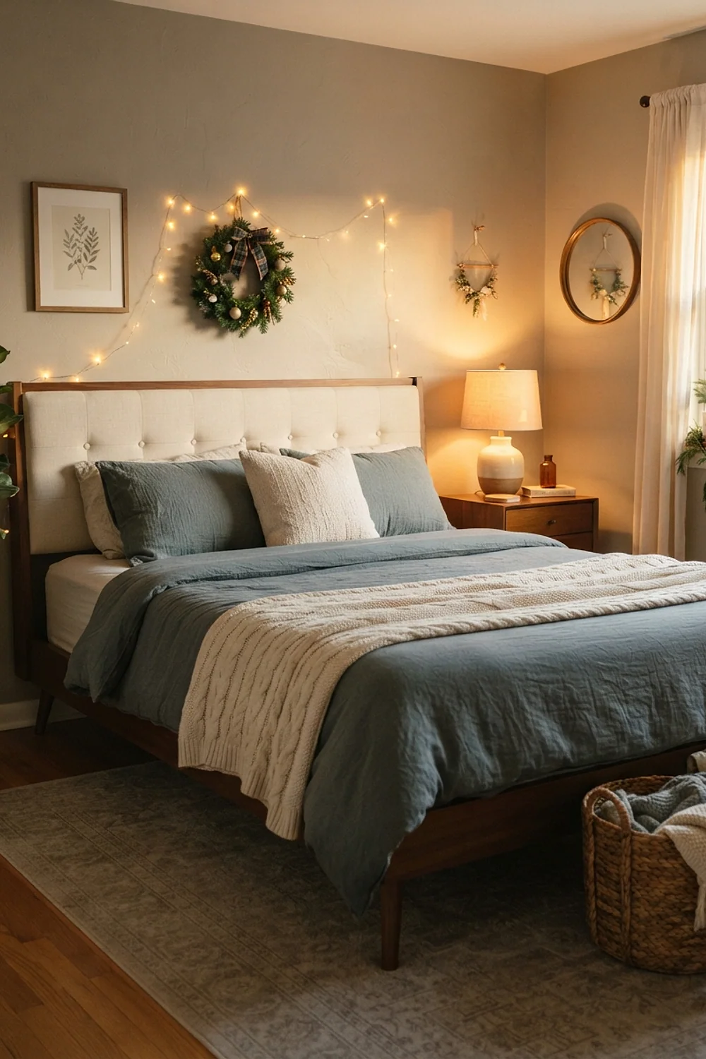
Blackout curtains in cream, hung 4 inches above the window frame, make a bedroom with a muted dark blue wall, something like Farrow & Ball Stiffkey Blue, usable for sleep. A reading lamp on each side handles the rest.
This suits people who sleep late or work nights. Pick cream with a yellow base, and the blue will look intentional instead of icy.
Testing colors before you commit to christmas bedroom decor
Testing colors takes about three days and a few cheap supplies. Paint two 2-by-2-foot swatches on different walls, one beside the window and one in the darkest corner.
On a gray Sunday afternoon in early December, the same paint can read two shades darker than it does on a bright morning. That’s the lighting you’ll live with all season.
- Check each swatch at 8am, 4pm and after dark with the lamps on.
- Hold the bedding against the swatch, not against the paint chip.
- Look at the swatch beside the white trim, since trim changes how undertones read.
- Step back 10 feet. A color that works at arm’s length can look different across the room.
Peel-and-stick samples save mess (though they never capture a wall’s true sheen). A painted board you can move around the room tells the truth.
Common mistakes
Look, a wrong wall color is rarely a repaint emergency. Most mismatches come from undertones clashing, and a few swaps can fix them in an afternoon.
- Identify the clash. If the red looks orange, the wall is leaning blue or green. If the green looks gray, the wall is too yellow.
- Swap the bedding first. A new duvet cover costs less than a gallon of paint.
- Change the bulbs. Moving from 4000K to 2700K shifts a wall noticeably.
- Add a neutral buffer, such as cream or oatmeal, between two colors that argue.
- Repaint only if the wall itself looks wrong in all three lighting conditions.
The fastest fix for an oversized color is to reduce it. Remove one of the three red pieces, and the room usually settles.
Bringing your christmas bedroom decor together
Christmas bedroom decor looks best when one undertone runs through the whole room and the seasonal color stays near ten percent. Start with the wall, then textiles, then ornaments, and test everything in your own light.
Save or pin this list so you can come back to it when you’re ready to start. Begin by holding the bedding you already own against a few paint swatches, and measure your headboard before buying any garland.
Frequently Asked Questions
What colors work best for christmas bedroom decor in a small room?
Soft neutrals such as Sherwin-Williams Alabaster, with one accent color, work best. Keep the red or green to about ten percent so the room doesn’t feel crowded.
Can I do christmas bedroom decor in a rental without painting?
Yes. Use textiles for color, such as a duvet cover, curtains and a throw, and let the walls stay neutral. Removable hooks and a tabletop tree add the rest without touching the paint.
Does red bedding make it harder to sleep?
Saturated red can feel stimulating in a large amount. A single red duvet or a few pillows is fine, and a deep burgundy is calmer than a bright cherry red.
How many colors should a holiday bedroom use?
Three is the practical limit: a wall color, a secondary textile color, and one accent. Beyond that, the room starts to feel busy instead of festive.