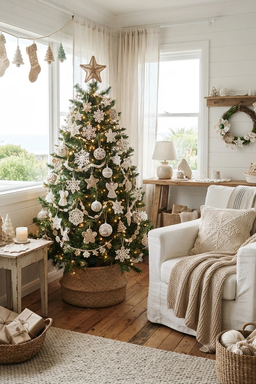
Yarn Color Schemes for Crochet Christmas Ornaments
By the end of this guide, you’ll be able to pick a yarn palette for crochet christmas decorations that looks deliberate against your real wall color, not just against a phone screen. Each pairing below works as a small before and after: the flat first attempt, then the adjustment that fixed it.
Wool smells faintly of lanolin when it comes out of storage, and a garland feels springy and dense under your fingers. But at 4pm on a gray December afternoon, that same garland can turn muddy against the wrong wall. Color is what decides it.
The color logic behind great crochet christmas decorations
Undertone matters more than the color name on the label. A red with orange in it fights a cool gray wall, while a blue-leaning red settles in beside it.
Stick to three yarn colors plus one neutral, roughly 60 percent, 30 percent and 10 percent. And favor choices you can undo: a garland comes down in ten seconds, a repainted wall doesn’t.
1. Cranberry red on Alabaster walls
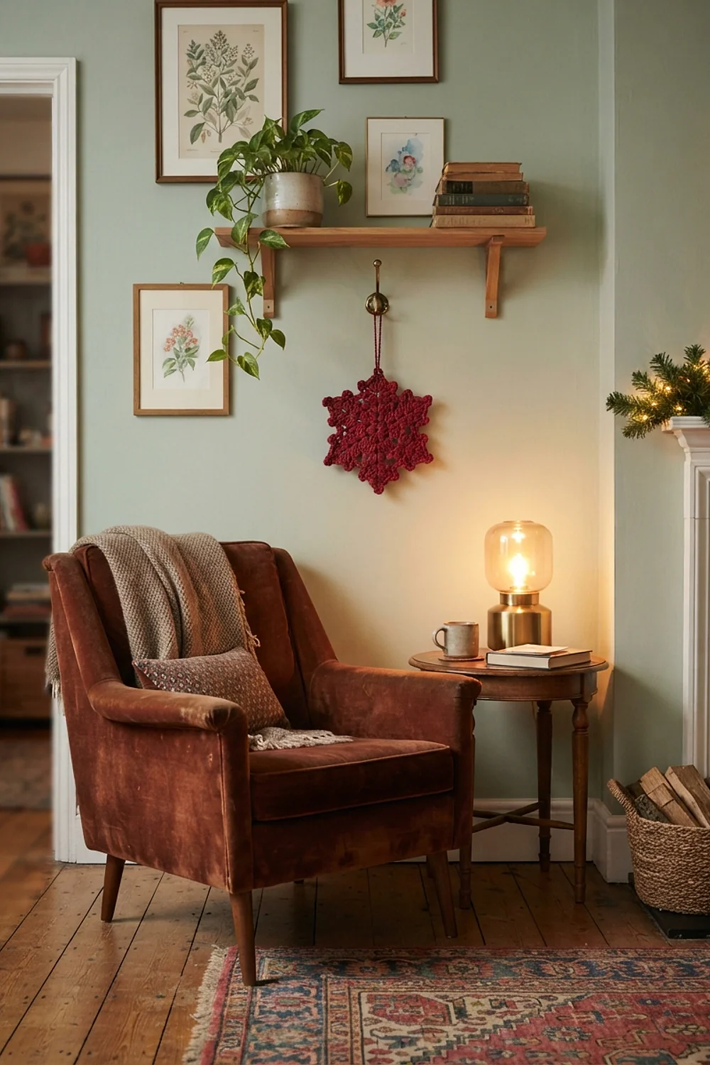
The usual mistake is buying an orange-leaning red like Red Heart Super Saver Cherry Red and hanging it against a creamy wall. Sherwin-Williams Alabaster has a yellow lean, so the orange-red starts to look like a traffic cone. Before: loud and flat.
After: a blue-based cranberry or wine in a wool blend, and the same wall suddenly glows. This suits traditional rooms with wood trim. Avoid mixing two reds in one garland, because the undertone clash looks like a dye-lot error.
2. Forest green stockings against greige

A set of four 18-inch stockings in a deep green such as Benjamin Moore Hunter Green looks sharp on a greige wall, and the yarn runs about $12 for the whole set. Hang them from a mantel with 6 inches of space between each one, so the cuffs don’t blur together.
This works best in rooms with white trim, where the green gets a clean edge. The catch is cheap acrylic, which can show a plastic sheen under a downlight. Test one skein first.
3. Cream and oatmeal garland on Pale Oak
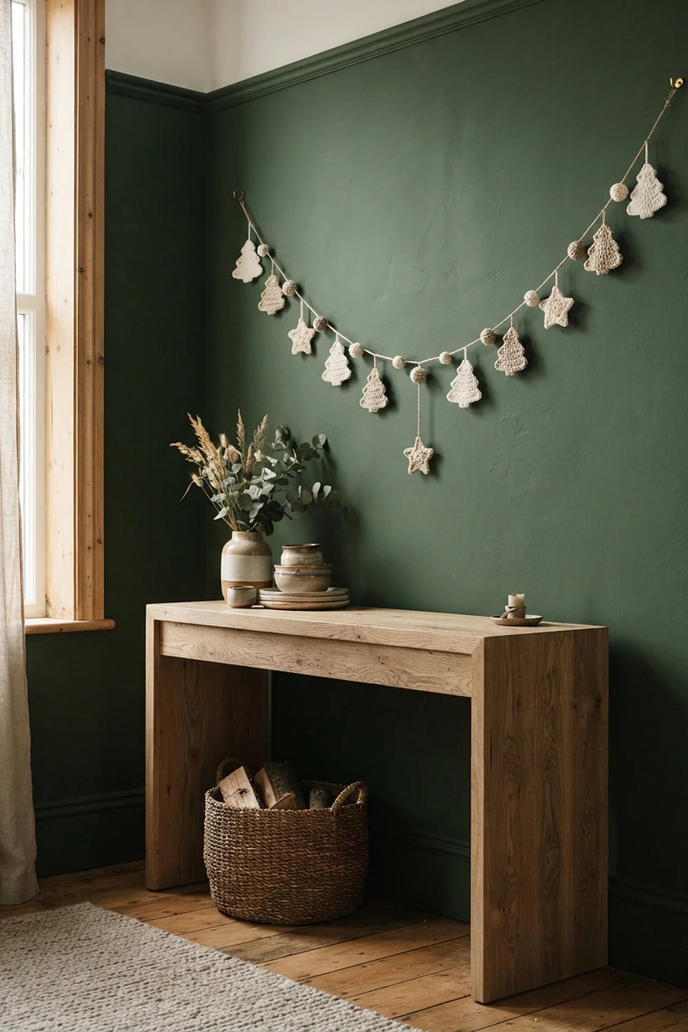
Garlands in two close neutrals are easy to store: coil them around a cardboard paper-towel tube and slide the whole thing into a cotton pillowcase. Pale Oak has a pinkish beige lean, so oatmeal looks calm beside it, where stark white would look cold.
This is the pick for small apartments with one shelf for holiday boxes. Skip plastic bins with tight lids for natural fibers, though. Trapped moisture leaves cream yarn smelling musty by next November.
4. Navy and white snowflakes in a Hale Navy window

Snowflakes stiffened with fabric stiffener hang on fishing line in a window, and the white shows up best against a dark frame. Benjamin Moore Hale Navy on a window wall turns each 4-inch flake into a crisp silhouette. Cotton in a true white beats ivory here, since ivory can look dingy against deep blue.
This suits bedrooms and entry halls with a single window. The thing to avoid is south-facing glass, because direct summer-strength sun in late December can still fade navy trim thread within a season.
5. Sage and cream amigurumi on Sea Salt
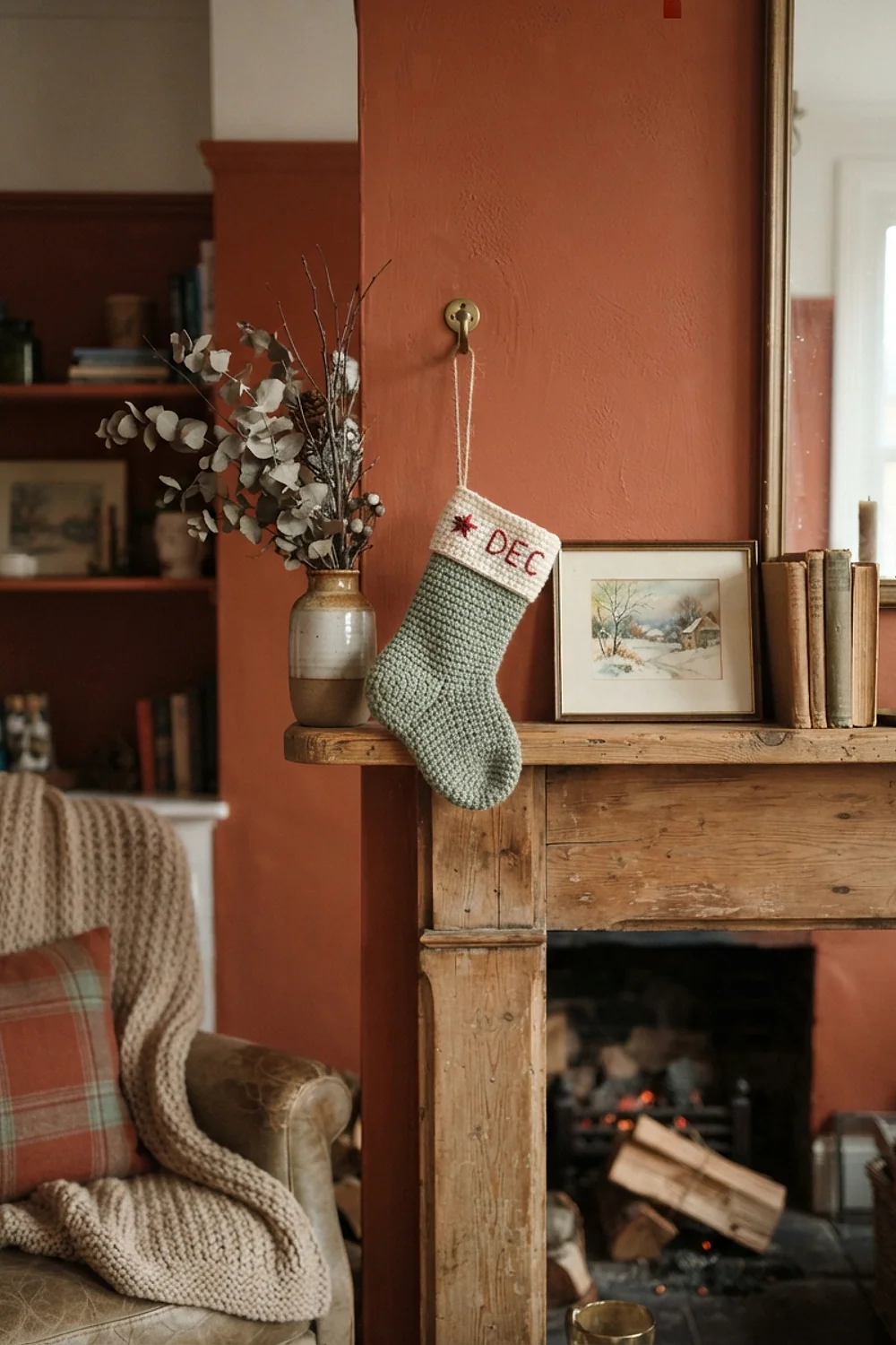
Tiny crocheted trees and mushrooms in sage green sit comfortably on Sherwin-Williams Sea Salt, because both carry the same gray-green base. The result is a quiet shelf where nothing shouts. Cream as the accent keeps it from going drab.
This is a good fit for bathrooms and nurseries, where the paint is already pale. Before buying yarn, hold the skein next to the wall, not under the shop light. Sage that looks gray in store lighting can turn minty at home.
6. Charcoal and blush tree placement
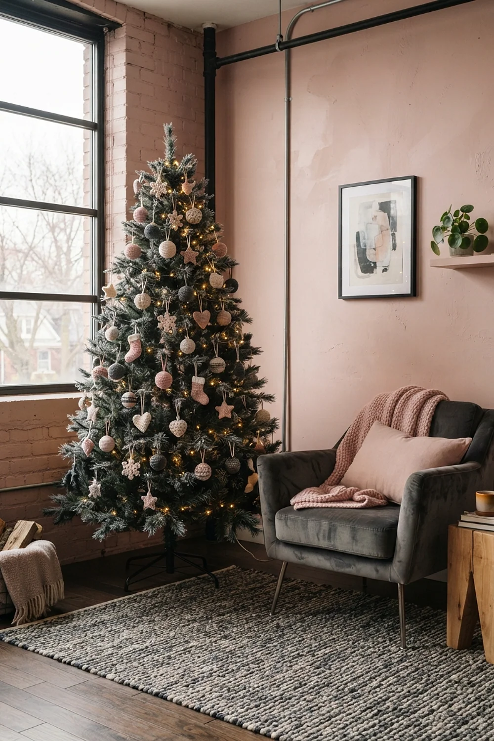
A tree with charcoal ornaments hidden deep in the branches and blush ones on the outer tips gives the whole thing depth. The dark yarn recedes, the pale yarn catches the light, and a 6-foot tree needs roughly 24 of each for a balanced spread. Cost lands near $15 in yarn.
This suits living rooms where the tree sits against a pale wall, like Benjamin Moore Edgecomb Gray. The mistake to avoid is clustering all the dark pieces low, which makes the tree look bottom-heavy.
7. Mustard accents in acrylic, wool and cotton
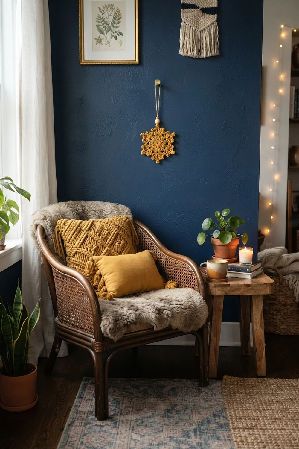
Mustard yarn changes personality with fiber. Cotton gives a matte, almost chalky finish, wool looks deeper and softer, and acrylic can look electric. Against Benjamin Moore Edgecomb Gray, a wool mustard reads as antique gold.
That makes it good for mid-century or farmhouse rooms with wood tones. Keep mustard to 10 percent of the palette, because it dominates fast. A single tassel garland is plenty.
8. A 48-inch black and white check tree skirt
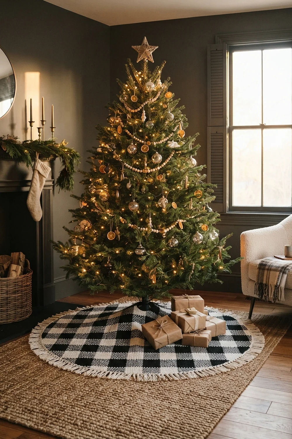
A buffalo check skirt in black and white needs 48 inches across to hold its own beneath a 7-foot tree. Smaller than 40 inches and the check pattern looks like a dinner napkin. Against a dark wall like Sherwin-Williams Tricorn Black, the white squares pop hard.
This is a bold choice for rooms with plenty of natural light. The trade-off is pet hair, which clings visibly to black yarn. Keep a lint roller nearby.
9. Gold lurex thread on deep green

Strands of gold lurex worked into green ornaments throw tiny sparks under string lights, and the effect peaks around 6pm when the room dims. Deep green like Benjamin Moore Hunter Green gives the metallic something dark to bounce against. Use one strand of lurex to two of wool.
This suits dining rooms and entry halls where lamps do most of the work. The thing to avoid is full-gold yarn, which looks brassy in daylight and flat at night.
More palette pairings for crochet christmas decorations
10. Ice blue stuffed ornaments for children’s rooms
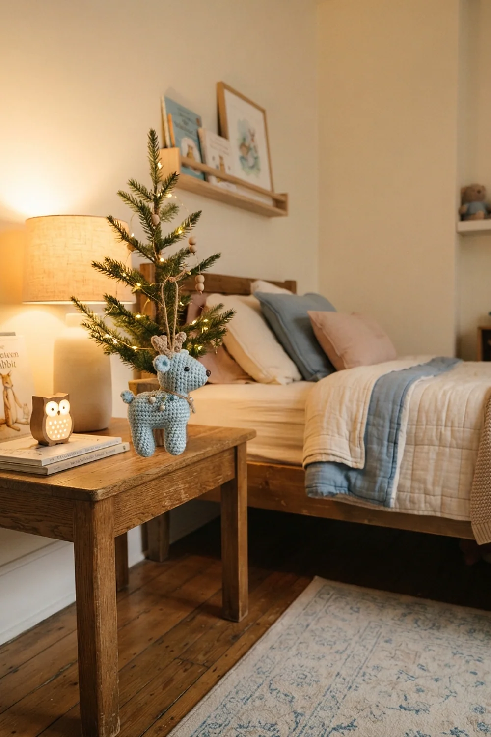
Pale blue ornaments stuffed with polyester fill feel pillowy in small hands, so they survive being grabbed. In a nursery painted a soft color like Benjamin Moore Palladian Blue, ice blue disappears slightly, and that’s pleasant. A skein of Paintbox Yarns Simply DK costs around $4.
This works for kids under six, who pull ornaments off the tree. Avoid felt or wired details, which snap off. Stitch eyes and noses in yarn instead.
11. Terracotta pompoms on Accessible Beige

Terracotta pompoms hung on a beige wall tend to vanish, because Sherwin-Williams Accessible Beige carries nearly the same clay undertone. Before: a garland you have to squint at. After: add rust and one deeper brown, so the garland has a darker edge to hold.
This fits desert or Southwestern rooms with plaster textures. Skip bright orange as the companion color, which makes terracotta look dull by comparison.
12. Dusty rose beside tomato red on Cloud White

Dusty rose and tomato red look rich together if the white behind them is clean. Benjamin Moore Cloud White is cool enough to keep the pink from going peachy. Use rose for 60 percent of the pieces and red for the sharp punctuation.
This is a fun scheme for a girl’s room or a sunroom. The risk is a yellow wall, where the pink looks salmon and the red looks orange. Hold a swatch up before committing.
13. Evergreen Fog and wooden bead garlands
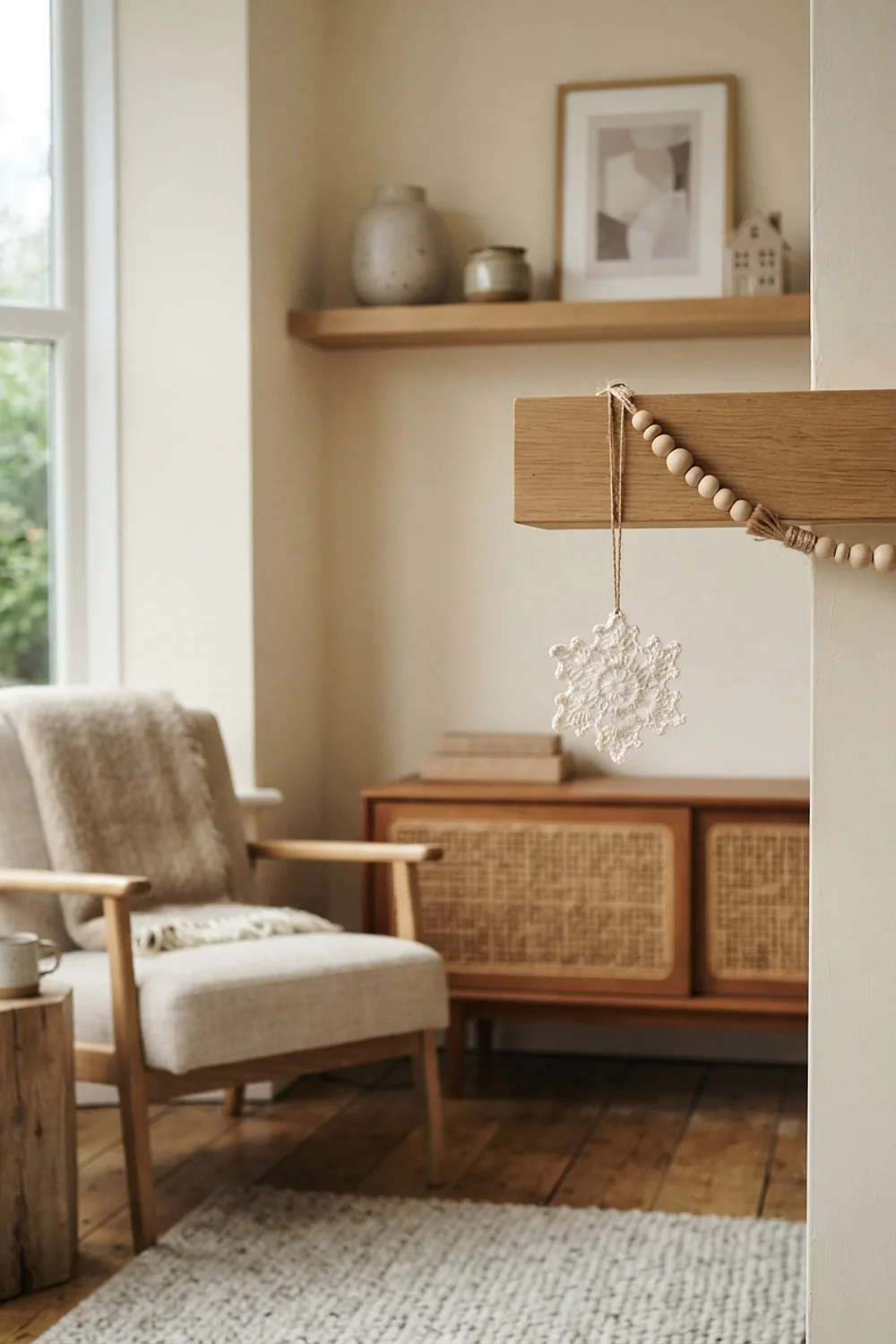
Storing dark green crochet beside white pieces risks color transfer, a problem called crocking, so layer tissue paper between them. Sherwin-Williams Evergreen Fog is a muted gray-green that lets natural wood beads stand out. The two together look relaxed, almost Scandinavian.
This suits a reading corner or a hallway console. Label each bag with the room it belongs in, so next year’s decorating takes 20 minutes instead of an afternoon of searching.
14. Burgundy mantel garland over Revere Pewter
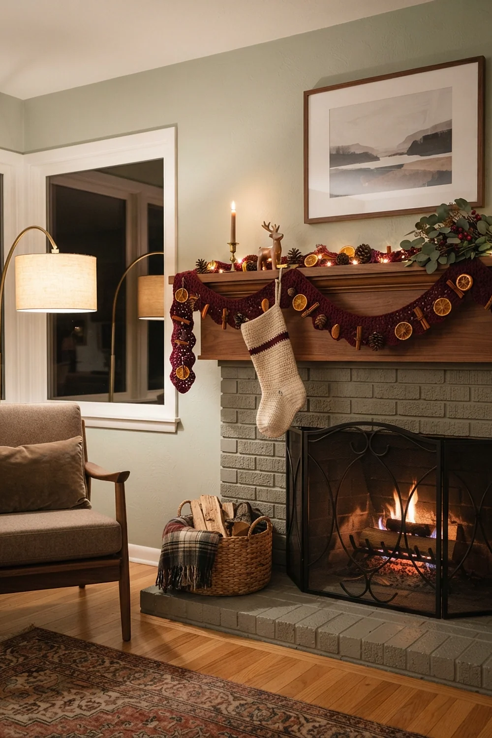
A 6-foot burgundy garland draped across a mantel in Benjamin Moore Revere Pewter hides the usual gap between stockings and artwork. Pewter is a warm gray, so burgundy leans rich rather than sharp. A 100-gram skein of Lion Brand Wool-Ease runs around $6 and covers most of it.
This is built for fireplaces and floating shelves. Don’t tack it directly into brick. Hook the garland over removable adhesive hooks instead.
15. Teal and copper on Wythe Blue
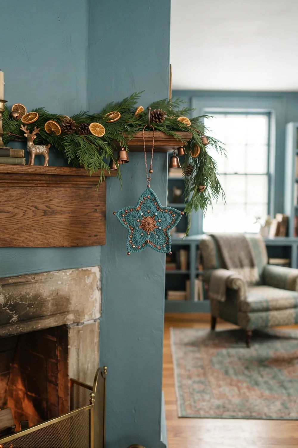
Teal ornaments on a Benjamin Moore Wythe Blue wall look like part of the architecture, and copper accents add a little heat. The two blues sit close enough that the garland feels woven into the room. Copper should stay around 10 percent of the palette.
This is a good option for dens with dark wood or leather furniture. Avoid mixing in a second blue, which shifts the whole scheme toward nautical.
16. Lavender-gray tree topper and silver tiers
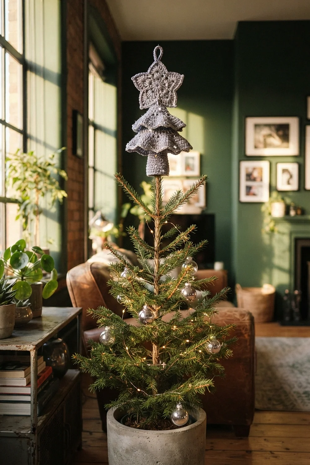
A lavender-gray star on top, silver snowflakes in the middle and white at the base give a tree a clear light gradient. Dark yarn sits near the trunk, light yarn near the tips. A 5-foot tree takes about 18 snowflakes to fill out.
This suits narrow trees in apartments, where visual weight matters. Don’t let the lavender lean too purple. Gray-leaning shades work with most pale walls.
17. Mercerized cotton on Gray Owl walls
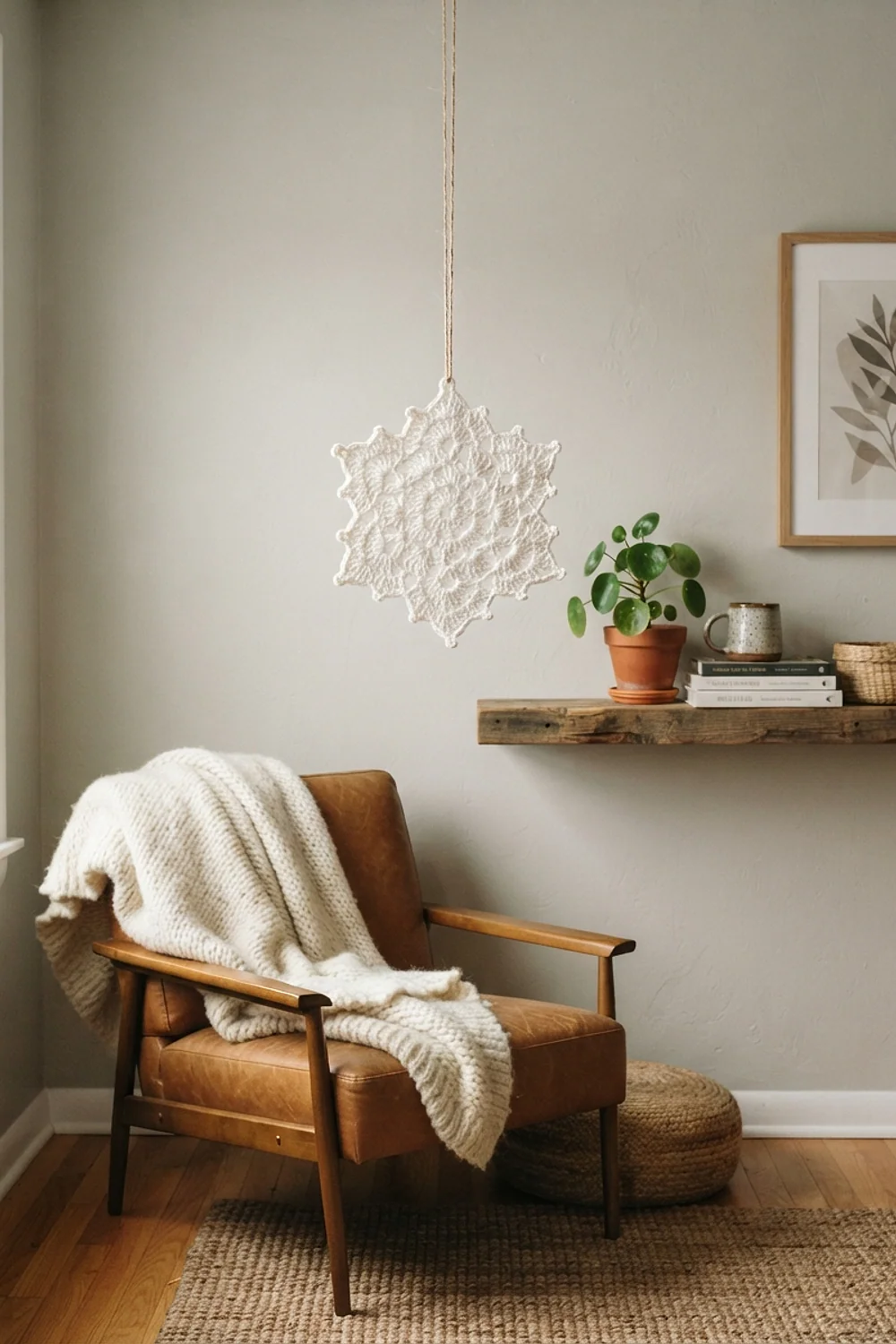
Scheepjes Catona is a mercerized cotton with a slight sheen, and it holds shape for small 3-inch ornaments far better than acrylic does. Against Benjamin Moore Gray Owl, white and silver Catona pieces look clean and crisp. Wool would look fuzzier and slump.
This is a smart choice for anyone who wants stiff, structured shapes. Cotton doesn’t bounce back like wool, so skip it for stuffed pieces.
18. Six-inch tartan bows on a 7.5-foot tree
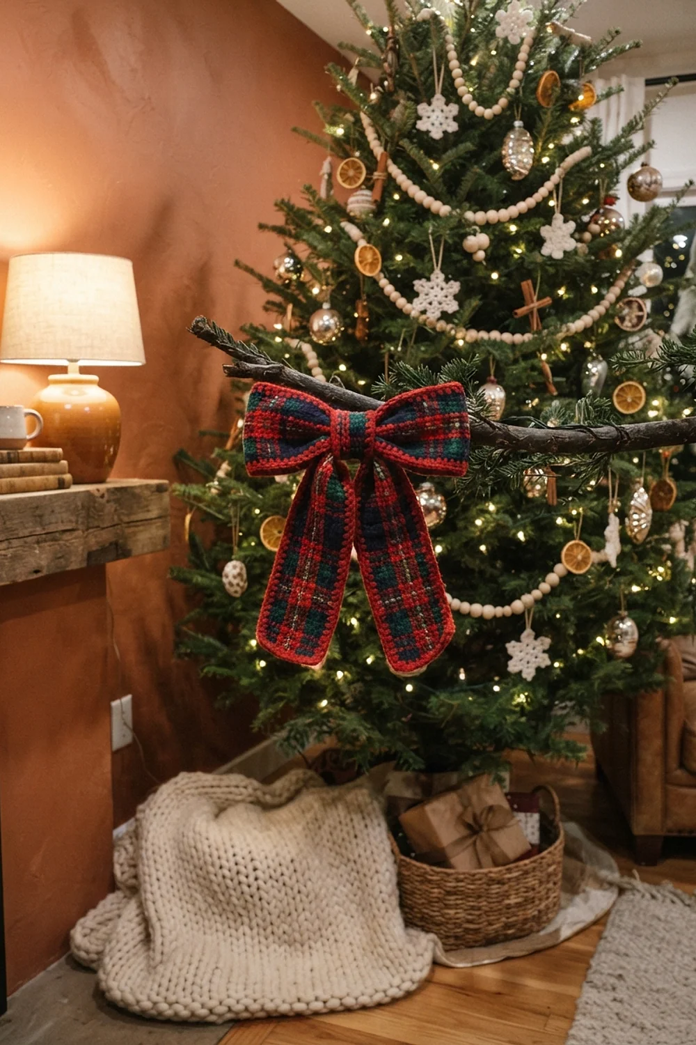
Oversized bows in red and green tartan need to be at least 6 inches wide to register on a 7.5-foot tree. Anything smaller turns into visual noise. One bow every 18 inches down the tree keeps the rhythm, and the yarn costs about $8 per tree.
This works in big living rooms with high ceilings. Use a quiet wall color like Benjamin Moore Cloud White behind it, because tartan already supplies plenty of pattern.
Unexpected undertone pairings for crochet christmas decorations
19. Ivory and gold under 2700K bulbs
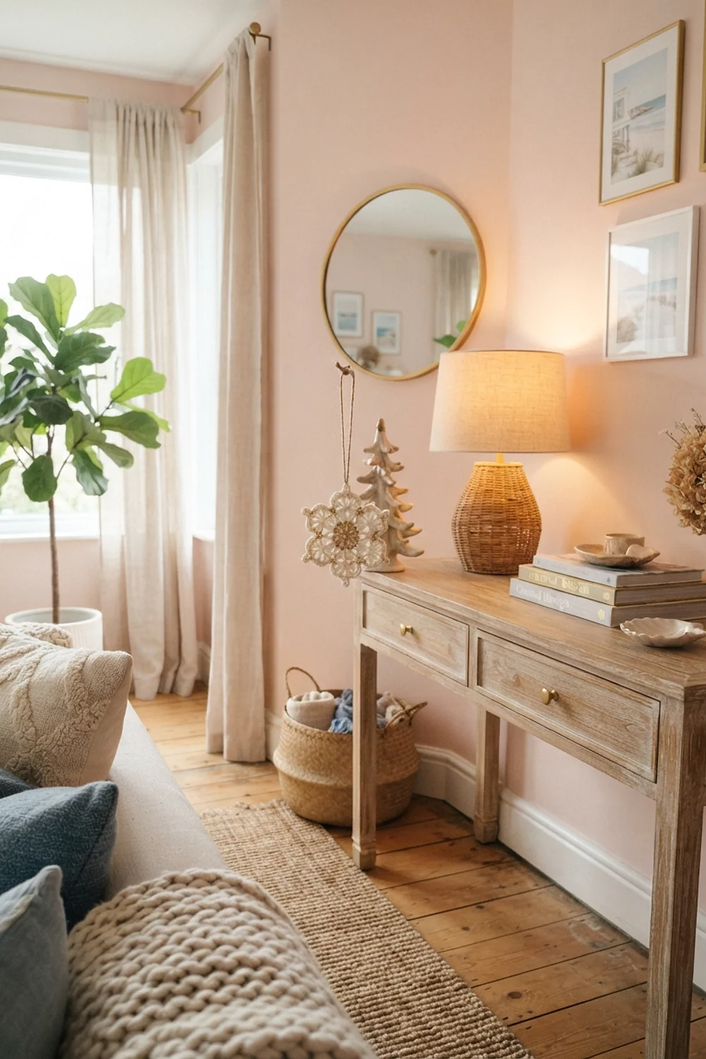
Warm 2700K bulbs turn ivory yarn creamy and gold yarn buttery, which is exactly why they flatter each other. Cooler 4000K bulbs wash the same garland to a pale yellow. A counterintuitive fact: wool often looks lighter under warm bulbs than it does in daylight.
This is made for evening rooms, such as dining areas and bedrooms. Check bulb temperature before buying yarn. The box tells you.
20. Chunky merino stockings in pigeon gray and red
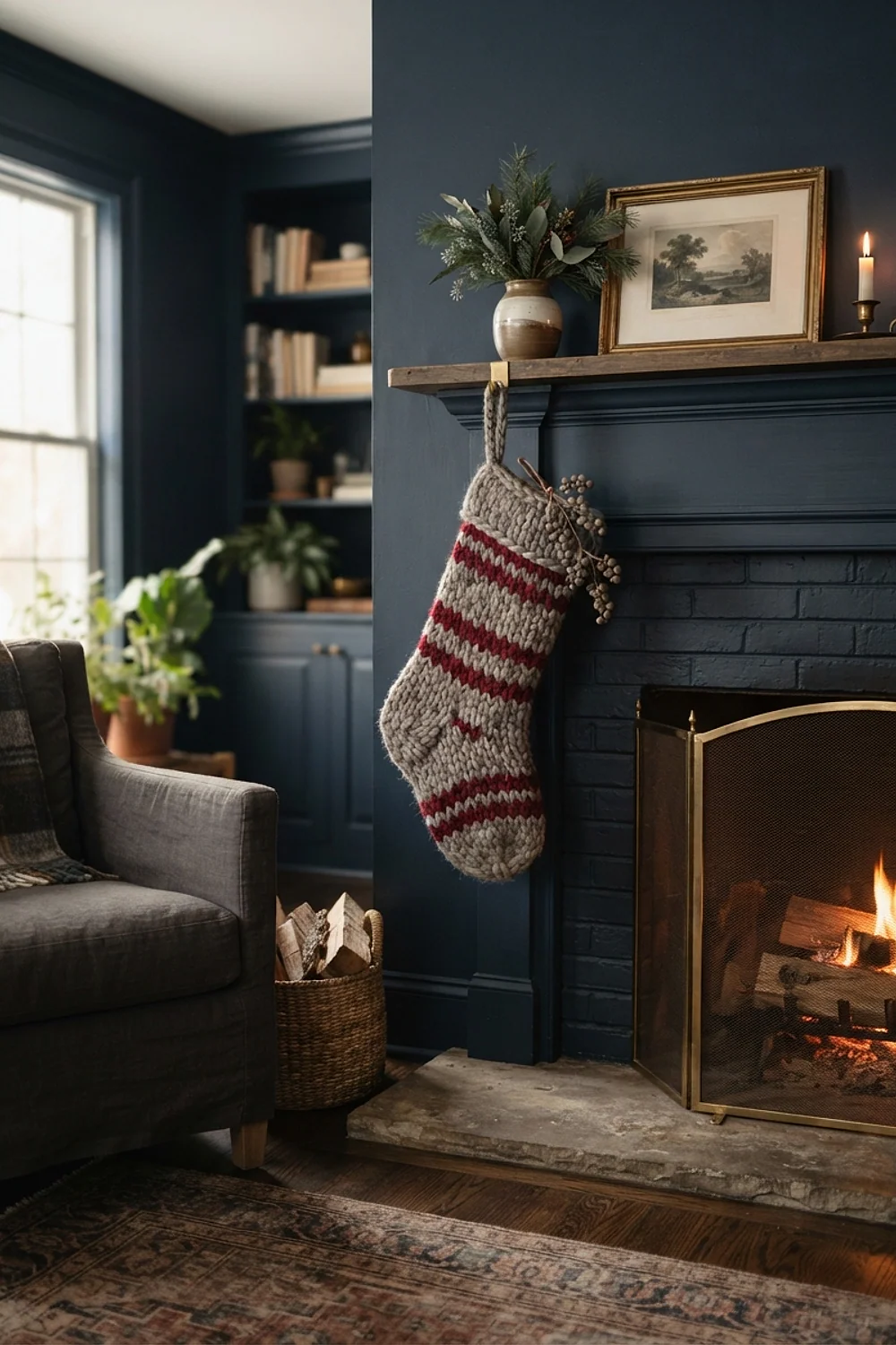
Chunky merino stockings feel plush under your hand, and the weight keeps them from curling at the cuff. Farrow & Ball Pigeon is a blue-gray that makes a true red look crisp. This is a strong choice for bedrooms where the stockings hang within arm’s reach.
Avoid superwash merino for hanging items. It stretches and sags under the weight of gifts.
21. Rainbow multicolor against white
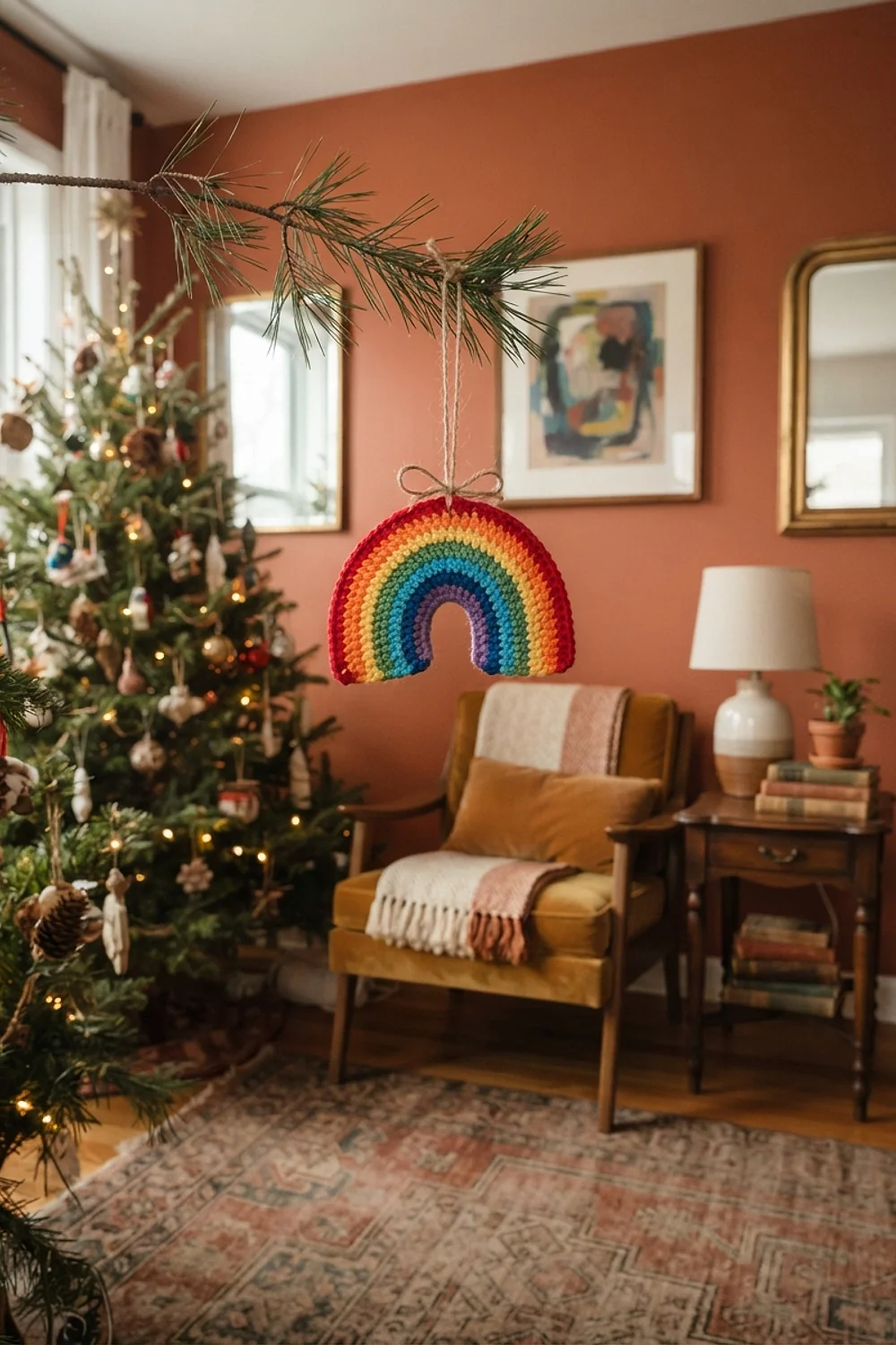
Eight bright colors on one tree look chaotic, not joyful. Limit the palette to three hues plus one neutral, and the same ornaments suddenly look planned. Sherwin-Williams Pure White behind the tree makes it feel crisp.
This fits playrooms and family spaces, where fun is the point. The common mistake is letting every skein in the stash end up on the tree. Pull out four and store the rest.
22. Black and copper on Urbane Bronze
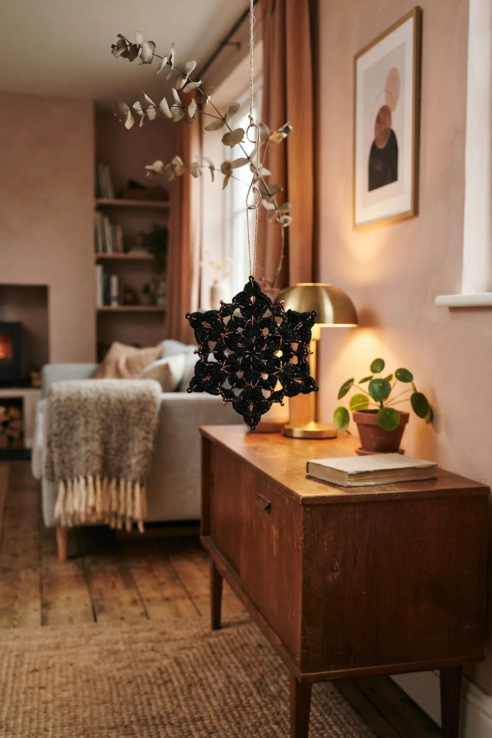
Black crochet stars with copper thread accents look dramatic against Sherwin-Williams Urbane Bronze, a brown-gray with real depth. A small set of 12 stars costs roughly $9 in yarn. Hang them in odd-numbered clusters of three or five.
This suits moody dining rooms and studies. Skip bright white for the companion color. It makes the whole thing look like a Halloween leftover.
23. A sage and cream wreath stored on a hanger
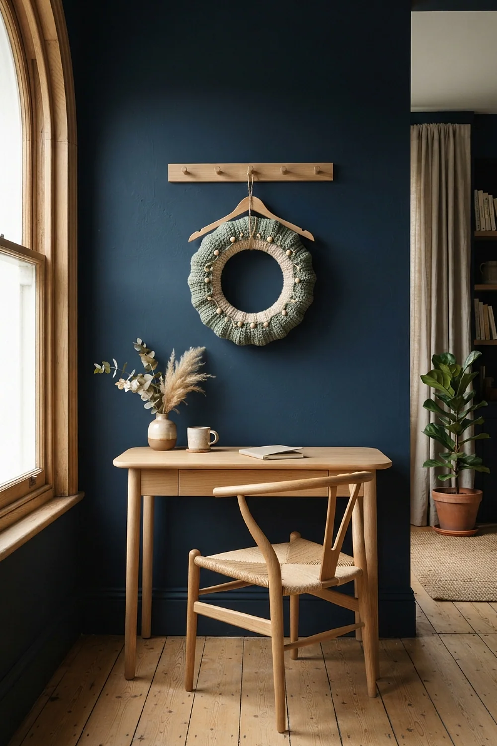
A crocheted wreath keeps its circle if it hangs inside a garment bag on a padded hanger, not flat in a box. Sage and cream fade slowly, so keep the bag away from windows. Wrap the wreath in acid-free tissue first.
This is ideal for closets with spare hanging rod space. Avoid plastic bags without airflow, since damp air turns cream yarn gray over a year.
24. Bunting across a bookshelf in Studio Green

Across a bookshelf, a 6-foot length of bunting adds color without taking up any floor space. Against Farrow & Ball Studio Green, a deep and inky green, cream and red flags stand out sharply. Tie the ends to removable hooks.
This works in rentals and dorm rooms, where nothing can be nailed in. Keep the flags 5 to 6 inches long. Longer ones sag at the center.
25. Mint and candy pink on Chantilly Lace
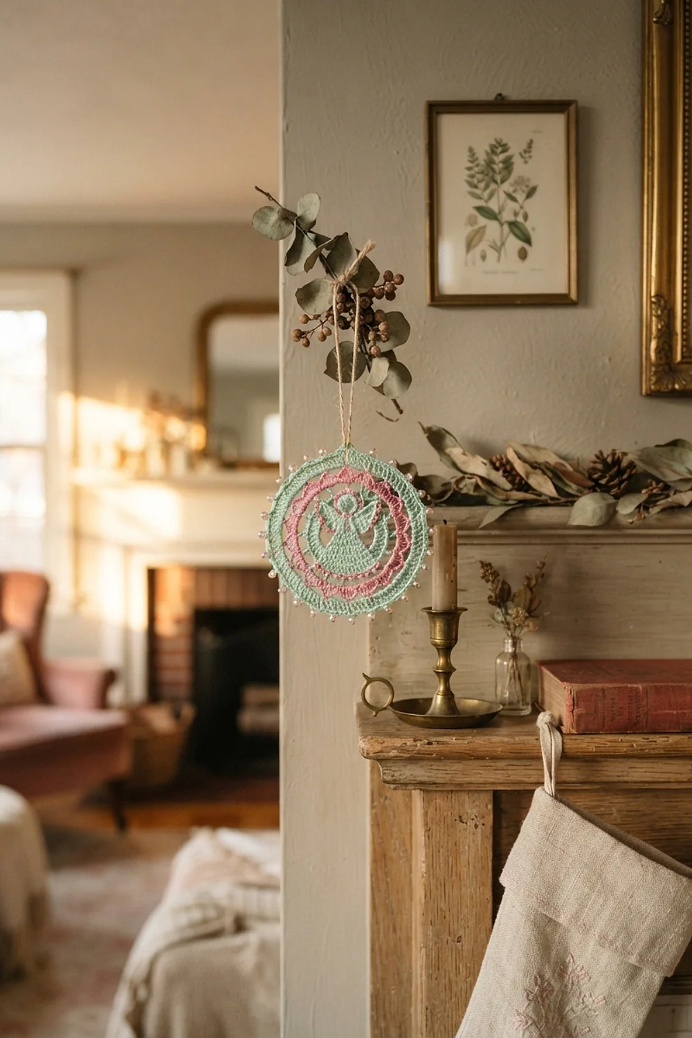
A retro scheme with mint and pink looks fresh on Benjamin Moore Chantilly Lace, a clean, bright white. The pastels need that crisp background, or they go chalky. A pale aluminum tree suits this palette better than a green one.
This works for kitchens and sunrooms with a playful feel. Avoid pairing it with dark wood, which makes the pastels look childish.
26. A 14 x 72 inch table runner in cranberry and cream

A runner measuring 14 x 72 inches fits a six-person table and leaves 12 inches of table visible on each side, so the wood still frames the cranberry and cream. Stripes run lengthwise, which pulls the eye along the table and makes it look longer. Materials cost about $18 in cotton yarn.
This suits dining rooms with wood tables and modest budgets. Pick cotton over wool, which pills under plates.
Lift candles instead of dragging them, since pulling snags the stitches and leaves wax in the cotton.
27. Undyed wool and jute on Setting Plaster
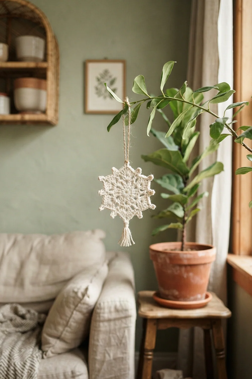
Undyed wool in oatmeal and brown looks right against Farrow & Ball Setting Plaster, a pink-beige that suits natural fibers because the warm undertone echoes the wool instead of fighting it. Jute twine hangers add texture without any extra color, and the wool’s natural lanolin gives the ornaments a slightly matte finish.
This fits rustic or Japandi rooms, where texture matters more than color. The trade-off is limited color range, so add one deep green accent for contrast. Keep it to a single accent, as more would crowd the quiet palette.
Testing colors before you commit
Crochet christmas decorations are cheap to test, so use that. Wind a few yards of yarn around a card and tape it to the wall for a day. Nothing permanent happens.
Check it at three times: 9am, 4pm and 8pm. Light shifts a yarn color more than you’d expect.
- Tape 6-inch strands of yarn to the wall, not just the skein label.
- Turn on the lamps you’ll actually use during the holidays.
- Take a phone photo in black and white to check contrast.
- Lay the yarn on your sofa or rug, not only the wall.
It’s not foolproof. But it works.
Common mistakes
Crochet christmas decorations that clash can usually be saved without unpicking a stitch. Start with the least permanent fix and work up.
- Swap the background: a neutral throw or tablecloth changes what the yarn sits against.
- Remove the worst offender, often one rogue color, and the rest settles.
- Add a neutral bridge, such as cream or oatmeal garlands, between clashing colors.
- Tea-dye white cotton for 20 minutes to tone down a harsh bright white.
Repainting for a four-week display is rarely worth it. Change the yarn instead.
Conclusion
The best crochet christmas decorations start with undertone, stay within three colors, and get tested at different times of day before anything is hung. Most mismatches fix themselves with a change of background or one swapped skein.
Save or pin this list so it’s handy when yarn shopping starts. Pick one pairing from above and tape a yarn strand to your wall before buying a full order.
Frequently asked questions
What colors work best for crochet christmas decorations?
Cranberry, forest green, cream and navy are the safest, because each has a cool or neutral undertone that suits most wall colors. Choose three plus one neutral. Test the yarn against your wall before buying in bulk.
How many colors should I use in crochet christmas decorations?
Three colors plus one neutral keeps a tree or mantel looking planned. A 60/30/10 split works well. More than four usually feels chaotic.
Will white crochet ornaments turn yellow over time?
Yes, cotton and wool can yellow from sunlight, moisture and age. Store them in acid-free tissue inside a cotton bag, away from windows. Acrylic yellows less but can still dull.
Does acrylic yarn look cheap on a tree?
Some acrylics have a plastic shine under downlights, but matte versions look fine. Wool blends and mercerized cotton hold color depth better. Test a skein under your lamps first.