

30 Zero VOC Paint Colors Worth Your Money
Most shoppers expect a zero-VOC label to mean a paint with no smell and no compromises. In practice, zero VOC paint colors still vary wildly in coverage, tint behavior and finish, and the label only means roughly under 5 grams per liter before pigment goes in.
This roundup sorts 30 picks by color family, with who each one suits and the one catch to watch. Skim the headings, find your room’s mood, and you’ll have a short list in minutes.
How these zero VOC paint colors were picked
Every pick below comes from published specs, finish ranges, and each color’s reputation for behaving well on real walls. Prices are typical gallon ranges and shift by store and sale, so confirm at the register.
Four filters decided what made the cut:
- A zero-VOC or near-zero base that holds up after tinting
- Coverage in two coats or fewer on primed drywall
- A color with a clear undertone, so it won’t surprise you at 4pm
- A finish range that suits bedrooms, living rooms or busy hallways
Here’s the counterintuitive bit. A zero-VOC base can pick up trace VOCs from the colorant, and deep shades need the most colorant. That’s why dark colors get extra scrutiny in the last section of picks.
Soft whites and warm neutrals
Benjamin Moore Natura in Simply White

A north-facing room on a gray November afternoon turns most whites chilly and flat. Simply White leans slightly warm, so it keeps a soft glow when the light is weak.
Natura runs roughly $75 a gallon and has almost no smell while drying. It suits bedrooms and nurseries. The catch is that the warmth shows against cool gray trim, so check it beside your trim first.
Sherwin-Williams Harmony in Alabaster

Alabaster is the white that gets picked because “it’s not stark,” then looks buttery yellow in the wrong light. The common mistake is pairing it with a stone countertop that has blue veining.
Harmony is a low-odor line that covers well in two coats. Choose it for living rooms with warm wood floors, and sample a large swatch before committing.
Behr Premium Plus in Swiss Coffee
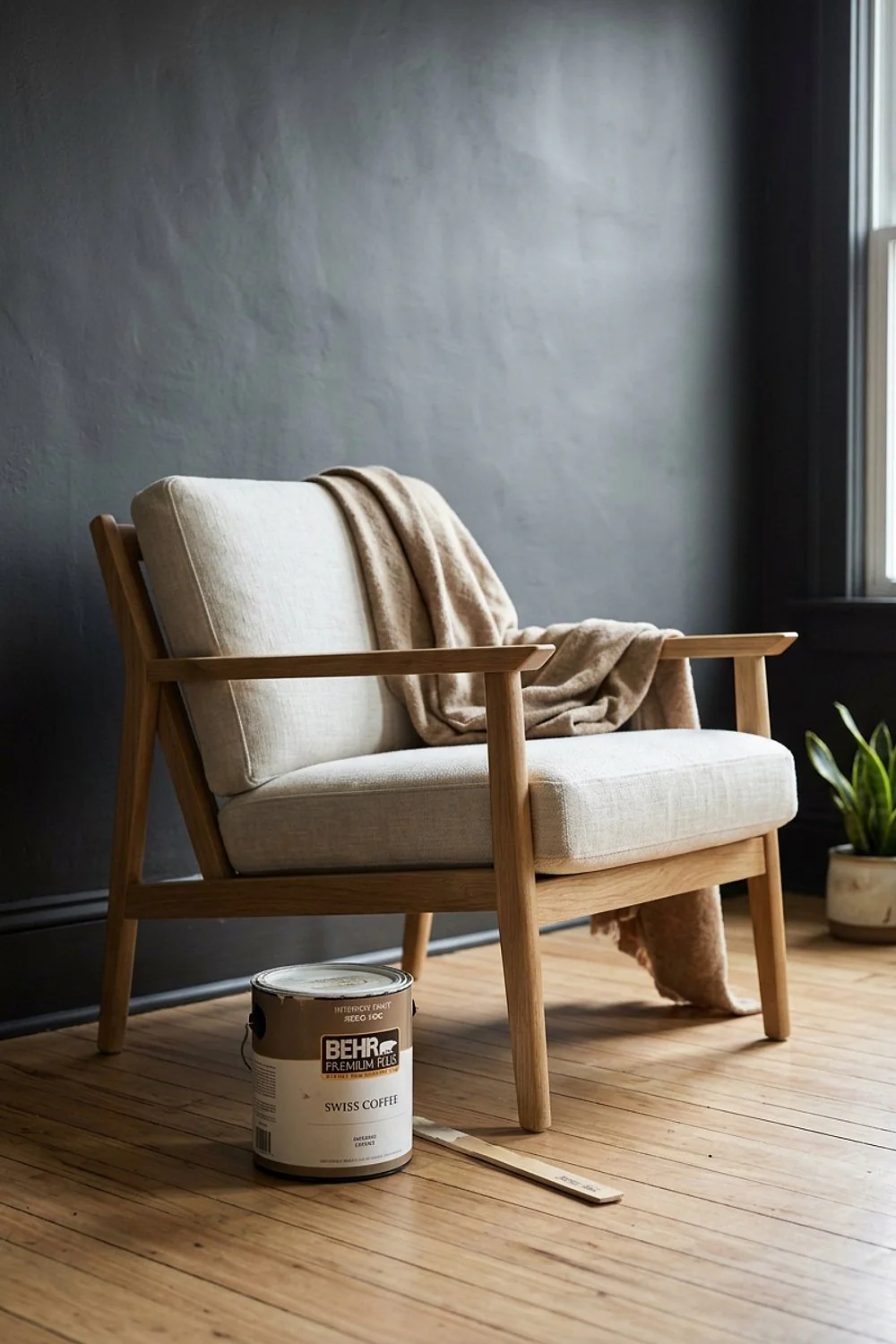
A flat or matte sheen hides drywall seams and patchy repairs far better than eggshell does. Swiss Coffee is a creamy, forgiving white that pairs well with that finish. Expect about $40 a gallon.
Behr’s lines differ by base, so read the can for the zero-VOC claim. It’s best for rental repaints and big surfaces where the budget has to stretch.
Benjamin Moore Natura in White Dove
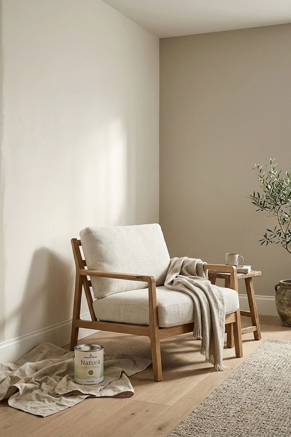
A soft, slightly greige white like White Dove feels easy on the eyes in a bedroom at night, because the gray-beige undertone cuts glare and reads like linen rather than printer paper. It suits people who find true whites harsh, especially in rooms lit by warm bedside lamps.
Keep trim one step brighter, or the walls can look dingy beside it. A crisp, clean white on baseboards and door frames gives the softer wall a clear edge.
Glidden Premium in a ceiling white
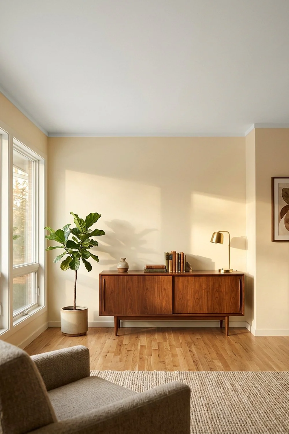
A 10 by 12 foot room has about 120 square feet of ceiling, and that’s a lot of surface to cover with a pricey paint. Glidden Premium in a flat white runs about $30 a gallon and keeps its zero-VOC base.
Use it overhead, where nobody sees fine texture. A tiny room with a low ceiling looks taller when the white stays clean and matte.
Accessible Beige in Sherwin-Williams Harmony

A pile of velvet cushions in rust or olive looks great against this shade, which works because it sits between beige and gray, so it flatters both oak and walnut floors instead of fighting either one.
It suits open-plan rooms where light changes all day, since the balanced undertone shifts less between morning and evening. Avoid it beside cold blue-gray tile, which can make it look muddy. Hold a sample next to any tile before committing.
Kelly-Moore Enviro-Cote in a pale neutral

One neutral running through the kitchen, dining area and living room without a visible break makes an open-plan home look calmer. Enviro-Cote is a zero-VOC line that goes on smoothly across big continuous walls, and painters like it because it leaves fewer lap marks.
It fits households wanting a single pale neutral over a large footprint. The trade-off is a smaller color library than the big-box brands, so bring a physical swatch and judge it in the room’s own light rather than from a screen.
AFM Safecoat Zero VOC in white
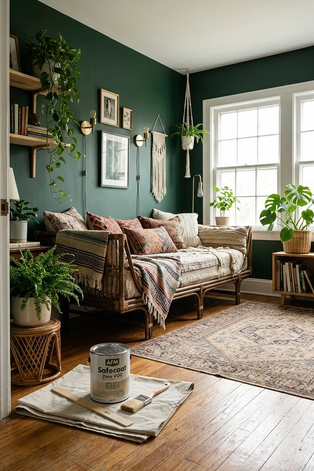
Leftover paint is easier to store if the lid is wiped clean and the can is pressed shut with a rubber mallet. This line is built for households sensitive to fumes, so it’s worth storing any extra for touch-ups.
It’s best for allergy-prone families and nurseries. The finish is flatter and the cost is higher than mainstream paint, but it behaves well.
Greige, clay and earthy zero VOC paint colors
Revere Pewter in Benjamin Moore Natura
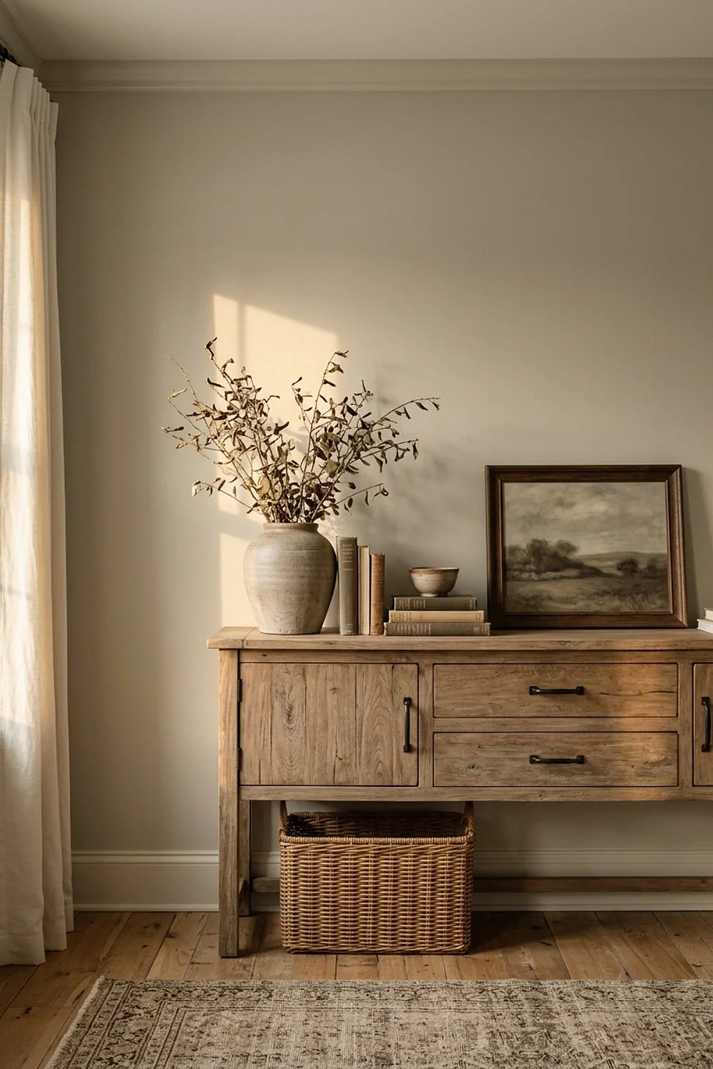
A linen sofa, brass lamp and jute rug all sit comfortably against Revere Pewter, a warm gray that lets natural textures lead. Put a matte black picture frame against it and the wall suddenly feels expensive.
It is best for living rooms that get moderate light, where the warmth keeps it from turning cold. Pay for a $75 gallon only if you’ll love it for years, since it’s pricey to repaint, and test a sample first.
Earthborn Claypaint in a muted clay tone
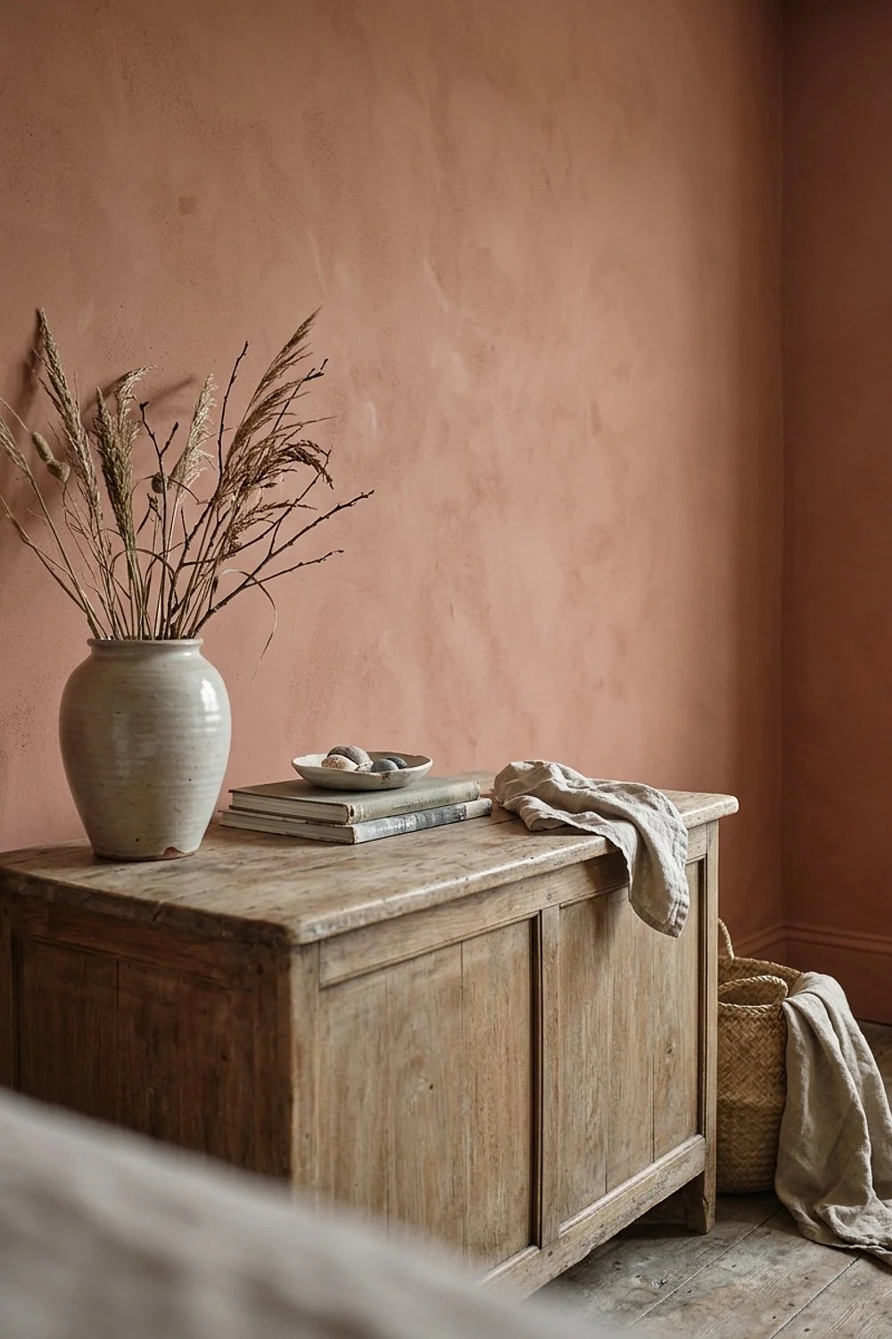
A velvety, almost chalky surface is what Claypaint dries to, and it stays breathable on plaster and older walls, letting moisture pass instead of trapping it behind a plastic film. It’s sold as VOC-free and has a very faint smell.
That makes it a good fit for period homes and anyone who loves a soft matte. The downside is that it scuffs more easily, so skip it in hallways with bikes and school bags.
Pale Oak in Benjamin Moore Natura

At 4pm in a west-facing room, Pale Oak turns from pinkish beige to a mellow stone tone. That shift is the reason sampling on two walls matters: the color is reacting to changing light, so one patch cannot show the whole story.
It suits bedrooms that get late sun, where the evening warmth settles the color. Watch for the pink undertone beside cool gray flooring, which can pull the beige toward rose. Check the samples at morning, noon and dusk.
Repose Gray in Sherwin-Williams Harmony
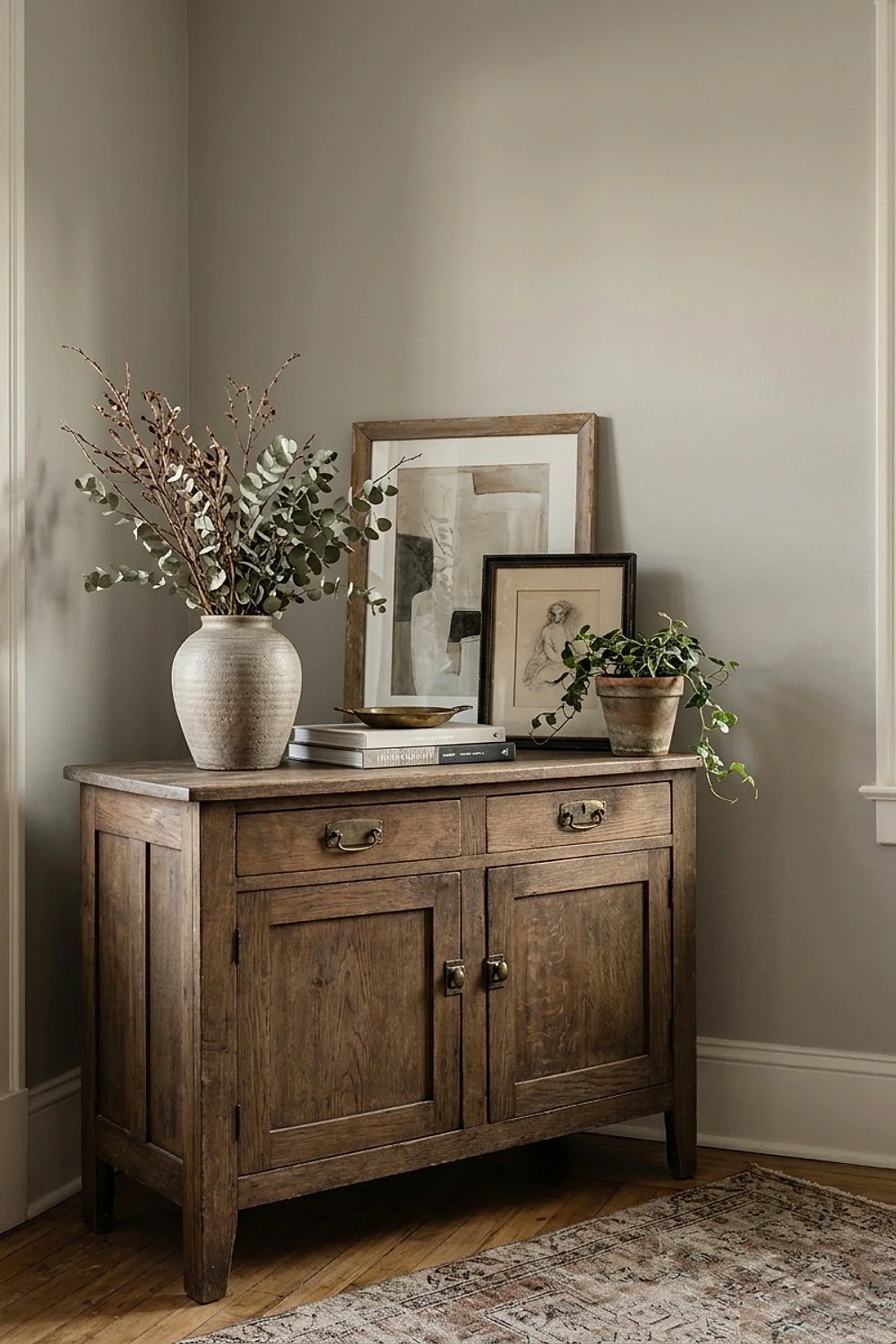
Gray with a hidden green or purple undertone is the usual reason a “neutral” wall goes wrong. Repose Gray has a gentle warmth that holds steady beside white trim.
Harmony’s low odor makes it a smart choice for a bedroom you want to sleep in the same night. Avoid it in a room with strong yellow bulbs, which push it greener.
Graphenstone Biosphere in a mineral beige

Lime-based and mineral, Graphenstone dries with a soft, stone-like depth that regular acrylics can’t copy, because the mineral particles scatter light rather than sitting under a plastic film. Expect about $95 a gallon.
It’s best for people who want a natural, antimicrobial surface in a bathroom or a humid room. Application has a learning curve, and it’s less forgiving of rushed coats, so practice on a spare board and let each coat dry fully.
Ecos Paints Organic Interior in a warm taupe

A warm taupe can look dull when it’s too brown, but this one has enough gray to feel calm. It’s formulated for people with chemical sensitivities, at roughly $70 a gallon, which is the real reason to choose it.
Pick it for a nursery or a child’s room, where low-odor air matters most. It takes longer to cure, so give it a full day before moving furniture back, since pressing furniture against soft paint can leave marks.
American Clay plaster in a sand shade

A palm run across a trowelled wall of this clay plaster feels like sun-warmed suede, and that tactile quality is the reason to choose it. It isn’t paint, but it is zero VOC, and the mineral surface softens light in a way a roller never can.
It suits a feature wall where texture matters more than speed. A 10-foot wall takes a patient weekend, so it fits a homeowner with time to spare. Avoid it in spots that take knocks, since it’s not forgiving of dents and repairs mean re-wetting and blending.
Real Milk Paint in a brick red
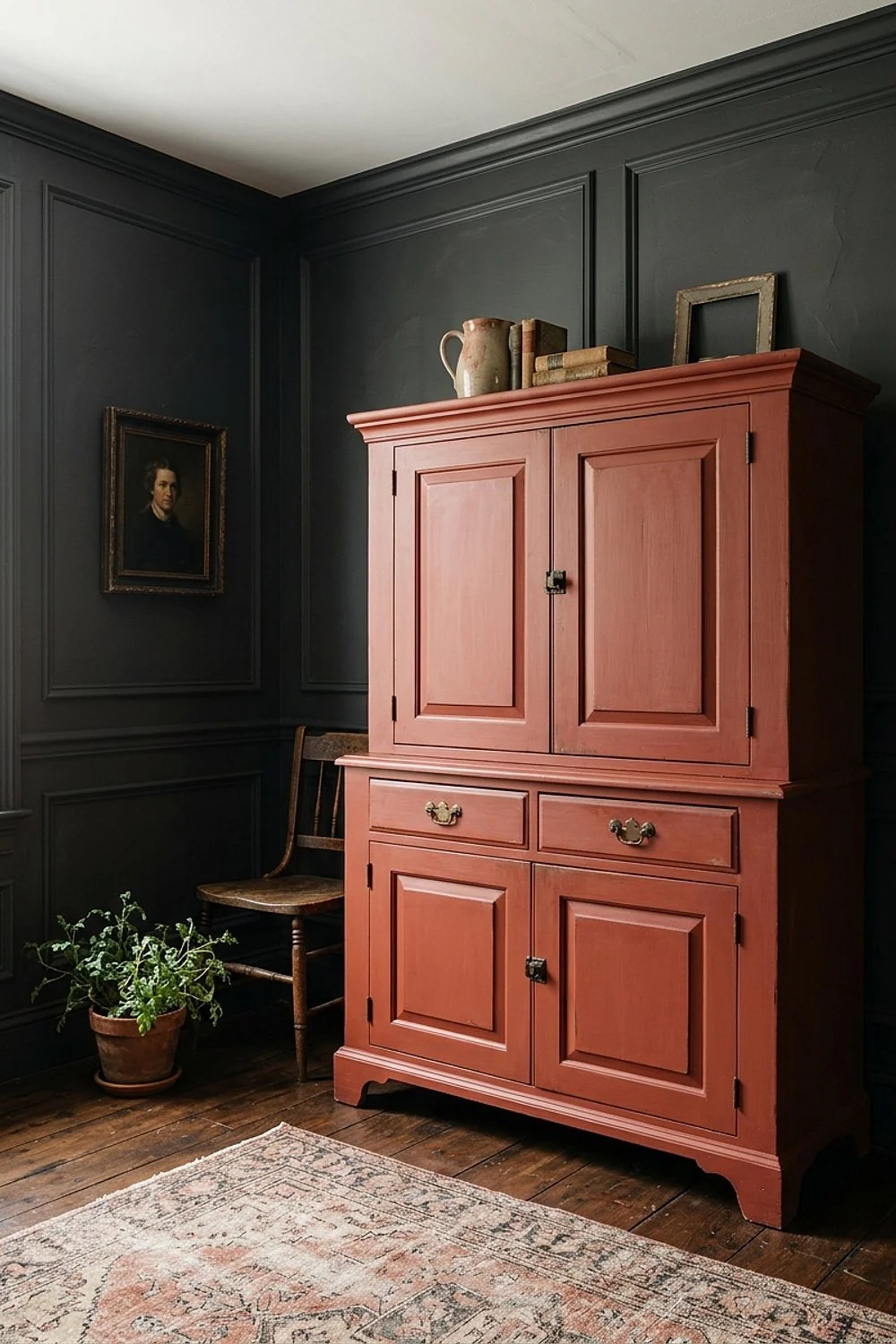
Powder mixed with water makes a small batch for a dresser or paneled wall easy to control, and the brick red cures to a flat, slightly uneven, very handmade finish. That chalky variation is the appeal on old wood.
It’s best for furniture and woodwork, and for anyone who enjoys a rustic look rather than a flawless one. Mix only what will be used that day, since it doesn’t keep well once wet, which means leftover liquid is wasted.
Greens and blues for every light level
Sea Salt in Sherwin-Williams Harmony

A gray-green that slides toward pale blue depending on what’s outside the window is the signature of Sea Salt in Harmony. Light does the work, borrowing sky and foliage tones, which is lovely in a bathroom with a big window and risky in a windowless one.
Expect about $75 a gallon. It suits bedrooms that want a spa feel. Sample it on two walls, because north light pulls it cooler and can tip it toward icy blue-gray.
Evergreen Fog in Sherwin-Williams Harmony
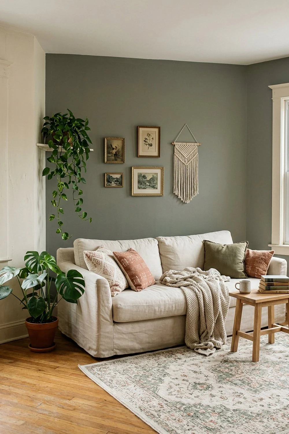
Priming before a color change is the step that saves the most trouble, because Evergreen Fog is a soft gray-green that can show the old color through when the previous wall was dark. A primer blocks that ghosting and evens out absorption so the pigment sits uniformly.
It’s lovely in a home office, where a calm, low-contrast wall helps concentration. Avoid the half-measure of skipping the second coat, which feels optional right up until it dries streaky. Do it properly once.
Palladian Blue in Benjamin Moore Natura
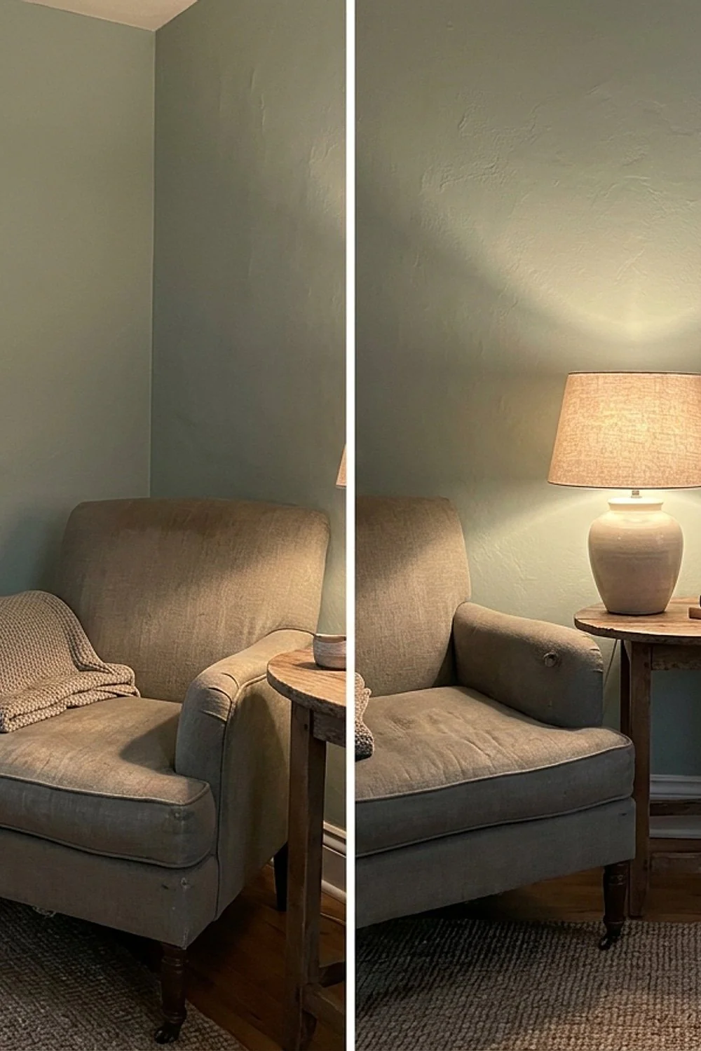
Faded glass is the best description of this dusty, aqua-leaning blue, and a smooth plastered surface shows it off. The soft finish gives the color a chalky depth, and the even surface lets light bounce cleanly instead of breaking into shadow.
It’s best for a sunny kitchen or powder room, where daylight keeps the aqua from going gray. On textured walls the color can look uneven, so smooth the surface first with skim coat or sanding, and prime the patched areas.
Rainwashed in Sherwin-Williams Harmony
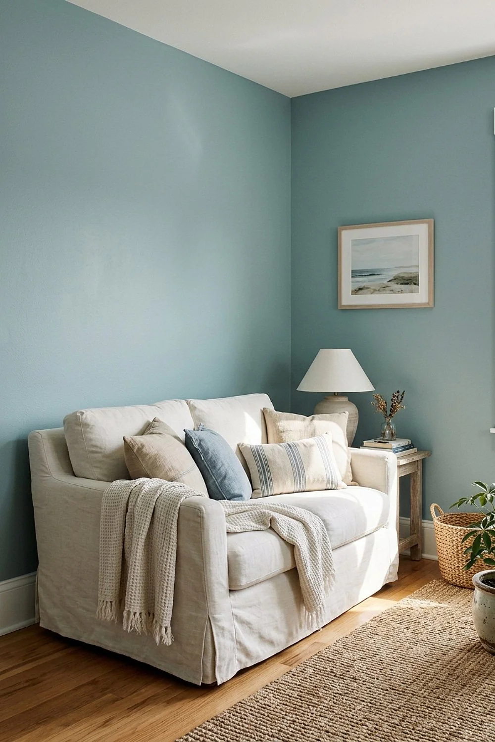
A pale blue-green you can sleep beside works because its light value keeps a bedroom from feeling heavy, where a deeper tone would press down under a low ceiling. Rainwashed reflects light and recedes, so walls seem farther away.
It suits small rooms of about 100 square feet. Cool-toned rooms may need warm bedding, such as cream linen or a camel throw, to keep it from reading icy, especially in north-facing light.
Mythic Paint in a dusty sage

A sage green on a 12-foot wall changes the scale of a room, making it look quieter and more grounded, because the muted green absorbs some glare and lowers visual noise. Mythic is a zero-VOC line at around $55 a gallon, so a full room stays reasonable.
It’s a smart pick for a reading corner or a budget-minded refresh. Coverage is good, though a primer helps over a bold prior color, and skipping it can leave a patchy, shadowed finish.
Glidden Premium in a muted teal

A muted, grayed teal avoids the problem of teal going from calm to cartoonish fast, because pulling back saturation lets the blue-green read as a soft backdrop. A low-saturation version also behaves well beside warm wood, where the orange undertone of oak or walnut balances the cool tone.
It’s best for a dining room or an accent wall. Skip glossy sheens, which exaggerate the color and show every roller flaw; a matte or eggshell keeps it quiet.
YOLO Colorhouse in a pale aqua

One pale aqua can read the same from the sofa and the doorway, which is what open layouts need, and this one holds up from every angle. Colorhouse is a zero-VOC line with a tidy, designer-friendly palette, so it coordinates easily with neighboring tones.
It suits an entry that leads into a living space. The line is sold through select stores, so check availability before planning your weekend, and order samples early to avoid a stalled project.
Auro natural paint in a pale green
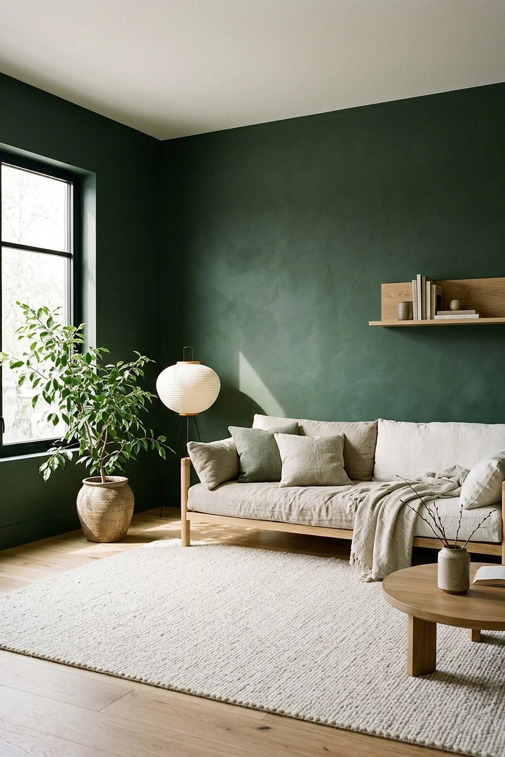
Plant-based ingredients give this German brand a mild, earthy smell, so a pale green in a closet or small bedroom feels fresh without shouting. Auro skips the harsh solvent odor that lingers in tight spaces, which matters where air barely moves.
It’s great for eco-minded shoppers and for anyone sensitive to fumes. Check the cure time, as natural binders often need more patience, and avoid scheduling a move-in or heavy use right after painting.
Deep, dark and bold shades
Hale Navy in Benjamin Moore Aura
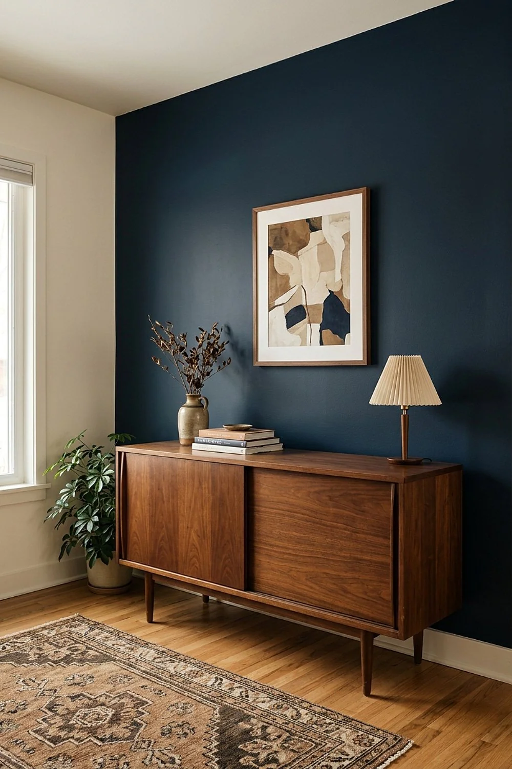
White trim and a camel leather chair against a Hale Navy wall is a combination that rarely fails, because the warm tan and crisp white both pop against the cool dark. The velvet depth of a matte finish is what makes the wall feel luxurious.
Expect about $90 a gallon. It’s best for studies and dining rooms. Dark colors need the best base, so confirm the can still reads zero VOC after tinting, since heavy colorant loads can change the rating.
Naval in Sherwin-Williams Harmony

Scrapes and sticky hands wipe off a satin or low-sheen finish far better than flat, which is why Naval, a classic navy, holds up in Harmony on a wall that takes abuse. It costs roughly $75 a gallon.
It suits hallways and a family room. Two coats over a gray primer will beat three coats over bare drywall, since the tinted primer gives navy a head start. Avoid skipping that step, or the deep color can look blotchy at the seams.
Kendall Charcoal in Benjamin Moore Natura
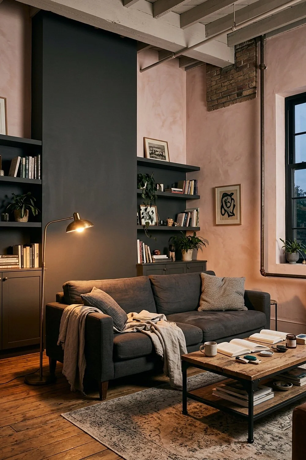
A deep, warm gray makes a small room feel cocooning, because the dark wall dissolves corners and the warm undertone keeps it from turning cold. Under a single bulb at night, Kendall Charcoal is moody in the best way.
It works for media rooms and bedrooms, where screen glare and soft light suit a dark backdrop. In a dark room with no natural light, it can feel heavy, so add pale curtains and a lighter rug to bounce light around.
Tricorn Black in Sherwin-Williams Harmony
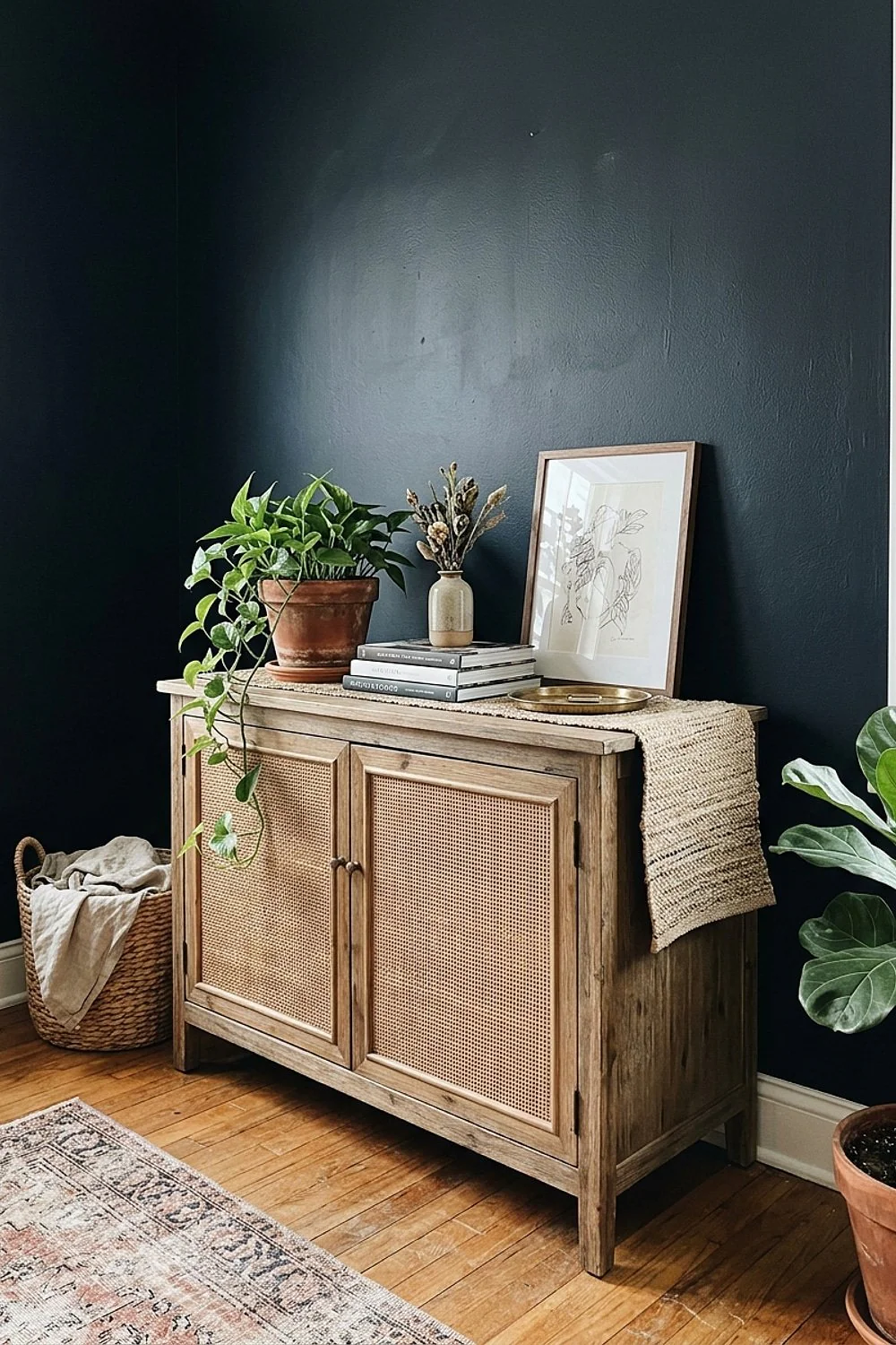
A pure black works best on a door, built-in or fireplace wall, where it reads as a deliberate accent. Paint the whole room black, and cheap drywall flaws jump out under raking light from a window or lamp.
Black walls aren’t the problem; flat black on bad prep is. Sand, prime and use two coats, and the wall looks sharp. That suits a confident renovator with time for prep, and a zero-VOC formula keeps fumes down in an occupied home.
Hunter Green in Benjamin Moore Natura
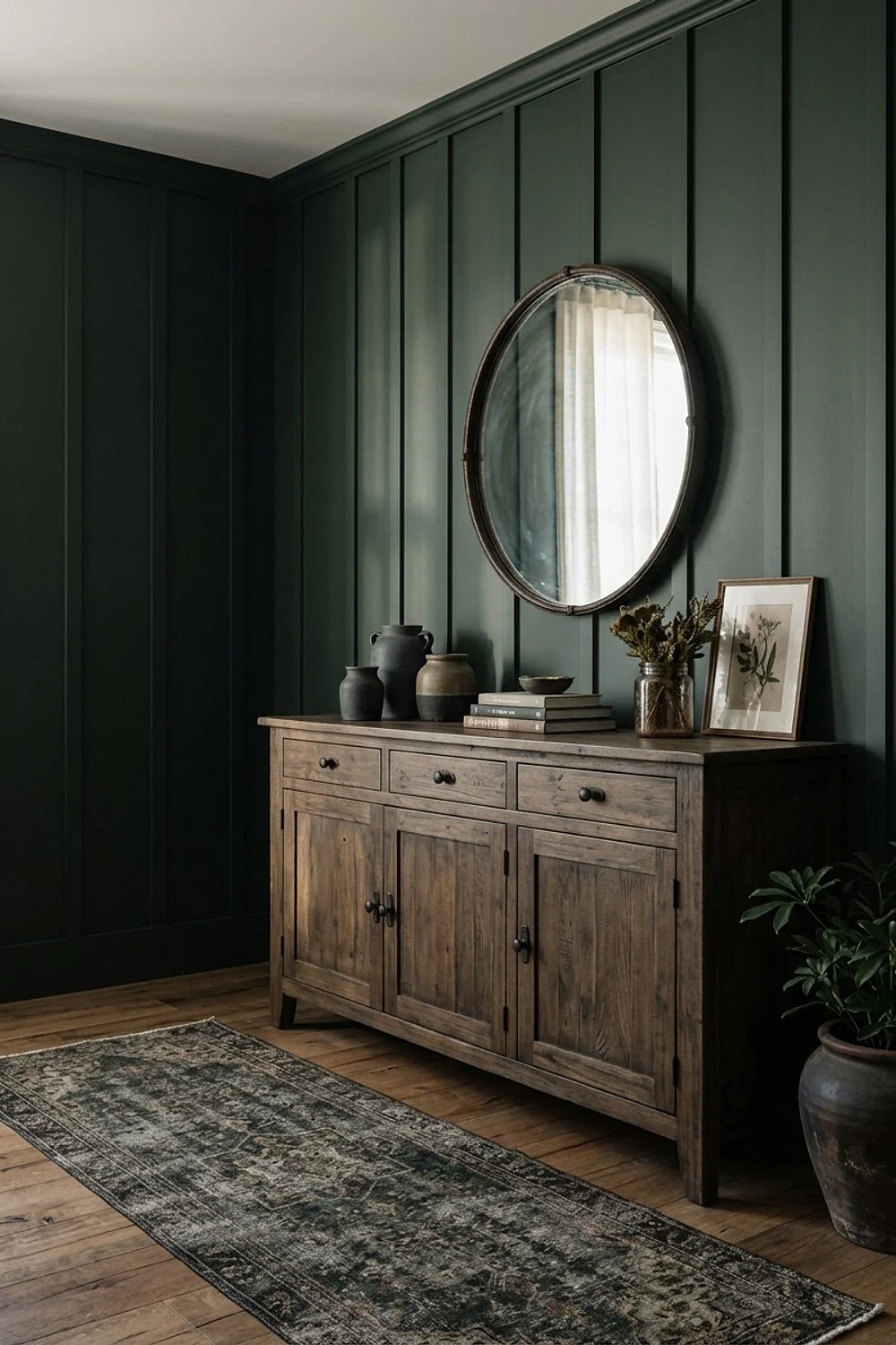
Walnut shelving and brass hardware glow against a deep Hunter Green, because the dark green sets off the warm wood and metal like a backdrop in a gallery. It’s the color that turns a plain bookcase into a feature.
It suits libraries and dens. On a laminate or glossy surface, it shows brush marks, so use a quality roller, and a bonding primer first, because dark paint highlights every ridge and missed spot.
Behr Marquee in a deep charcoal-blue
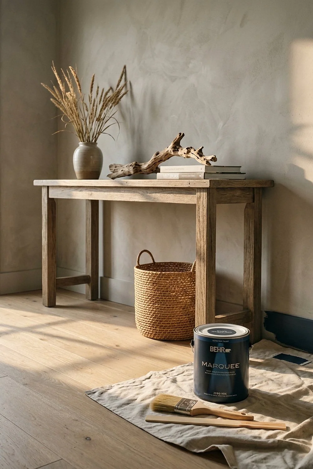
A charcoal-blue in a bedroom feels like a hotel suite, because the blue keeps the dark gray from turning flat or sooty. Marquee is Behr’s higher tier, and at about $50 a gallon it’s far easier on the wallet than premium rivals.
It’s a good choice for a bedroom where you want calm and depth. Confirm the zero-VOC claim on the specific base, since dark tints use more colorant, and ask the store to verify the formula before mixing.
Budget vs splurge: where your money goes
Zero VOC paint colors fall into three tiers, and the spread is wider than most people expect. Here’s how they break down:
- Roughly $30-50 a gallon: Glidden Premium, Behr, Kelly-Moore, good for ceilings and rentals
- Roughly $70-90: Natura, Harmony, Aura, best for bedrooms and living rooms
- $95 and up: Graphenstone and specialty plasters, for texture and long-term wall health
The mid tier is where most rooms should land. It covers in fewer coats, which saves a Saturday.
Splurge on the walls you’ll touch and see daily. Save on ceilings, closets and the garage-facing hallway.
Investment buys worth making
Zero VOC paint colors still need a proper test before they cover a whole room. Start by reading the technical data sheet, not just the front label.
- Confirm the VOC figure is for the tinted paint, not only the base.
- Buy a sample pot and paint a 2 by 2 foot patch on two different walls.
- Look at it at 9am, 4pm and under lamps at night.
- Check the finish: matte hides flaws, satin wipes clean.
- Prime over dark or glossy walls so you don’t need four coats.
It’s not foolproof. But it works.
Final thoughts on choosing your color
Zero VOC paint colors are no longer a compromise, and the best of them match mainstream paint for coverage and depth. Start with the family that fits your light, then pick the tier that fits the wall’s workload.
Save or pin this list so it’s ready when you start painting. Try one sample patch first, and measure your wall height before buying so you get the gallon count right.
Frequently Asked Questions
Is zero VOC paint really odor-free?
Not entirely. Zero VOC paint colors have far less smell than traditional paint, but binders and pigments can still give off a mild scent for a day or two. Open a window and run a fan.
Can I tint any zero VOC paint to a dark color?
Usually, yes, but the finished can may no longer be strictly zero VOC. Ask the store for the tinted VOC figure, especially for navy, charcoal or black.
How long should I wait before sleeping in a freshly painted room?
With low-odor lines, many people sleep in the room the same night with the window cracked. Natural and clay paints can take longer to cure, so give those about 24 hours.
Do zero VOC paint colors cost more than regular paint?
Mid-range zero VOC paint colors cost about the same as standard premium paint. Budget lines are comparable too, and only specialty mineral or natural paints run noticeably higher.